Feb 27 - May 16, 2018
Read essay here. | Some works may still be available, please contact the gallery at 212-581-1657


Essay by Emily Lenz
Paul Reed is one of the six original members of the Washington Color School, which began with Morris Louis (1912-1962) and Kenneth Noland (1924-2010) and grew to include Paul Reed (1919-2015), Gene Davis (1920-1985), Thomas Downing (1928-1985), and Howard Mehring (1931-1978). The artists were defined as a school by the 1965 landmark exhibition Washington Color Painters, curated by Gerald Nordland at the Washington Gallery of Modern Art. These DC-based artists used recently developed acrylic paints directly on unprimed canvas, embedding or staining the color into the painting surface, to create a new sense of color. Juxtaposed against the raw canvas, the glowing matte color appears to float off the painting. The artists experimented with pouring, sponging, rolling, and blotting to see how color creates movement and depth. While some worked intuitively and others mapped out their compositions, Gerald Norland in his exhibition text noted there were no accidents with the Washington Color painters- even in Louis’s flowing Veils there was order and gravity. Our exhibition of Paul Reed’s work from 1962 to 1967 shows his exploration of color and transparency to achieve movement in evolving series: first with biomorphic shapes in circular motion (1962 to 1964), then in geometric structures (1964 to 1965) that crystallize into grids (1966), which then twist and stretch into shaped canvases (1966-1967).
At the time of the 1965 Washington Color Painters exhibition, Morris Louis had passed away and Gerald Nordland said Reed was “the only painter who continues to explore the possibilities of transparency which were set out originally by Morris Louis.” Like Louis, Reed worked in an experimental approach through series to investigate the properties of color through layering of paint, which required great skill in handling. The progression in Reed’s compositions is evident in a diagram of thumbnail sketches showing his series from 1962 to 1971. The earliest works rely on biomorphic shapes to provide movement (such as #12, 1962). The forms are then simplified to large geometric shapes to explore transparency and color (such as Disk Painting #29 , 1965). In 1966 Reed moves to grids and bands as a neutral form to hold color (such as Intersection XII, 1966) and emphasize the interaction of overlapped colors.
The variety within Reed’s series is unique among the Washington Color School. Thomas Downing was the next most varied. In Reed’s 1994 oral history for the Archives of American Art, he describes his process with each series in three steps. First, he draws shapes until he settles on a form that will hold his envisioned color exercise. Second, he works in collage and colored tissue paper to see how the color and transparency might work. Third, he applies the form to canvas, now intuitively seeing where he can take the color. Once he has achieved the most complex and sophisticated colors for that form, the series is over. Reed said all his ideas were built on lessons learned from previous forms. With color interaction performing differently with scale, Reed felt it was important to limit “the number of straitjackets you put on.” (Interview with artist, 2013) Reed and childhood friend Gene Davis agreed that repeating a composition allowed for deeper exploration of color, but Reed felt there were finite possibilities. When Reed ended a series he did so to increase the complexity of the next composition, as color always provides new challenges.
Discussion of Art Works
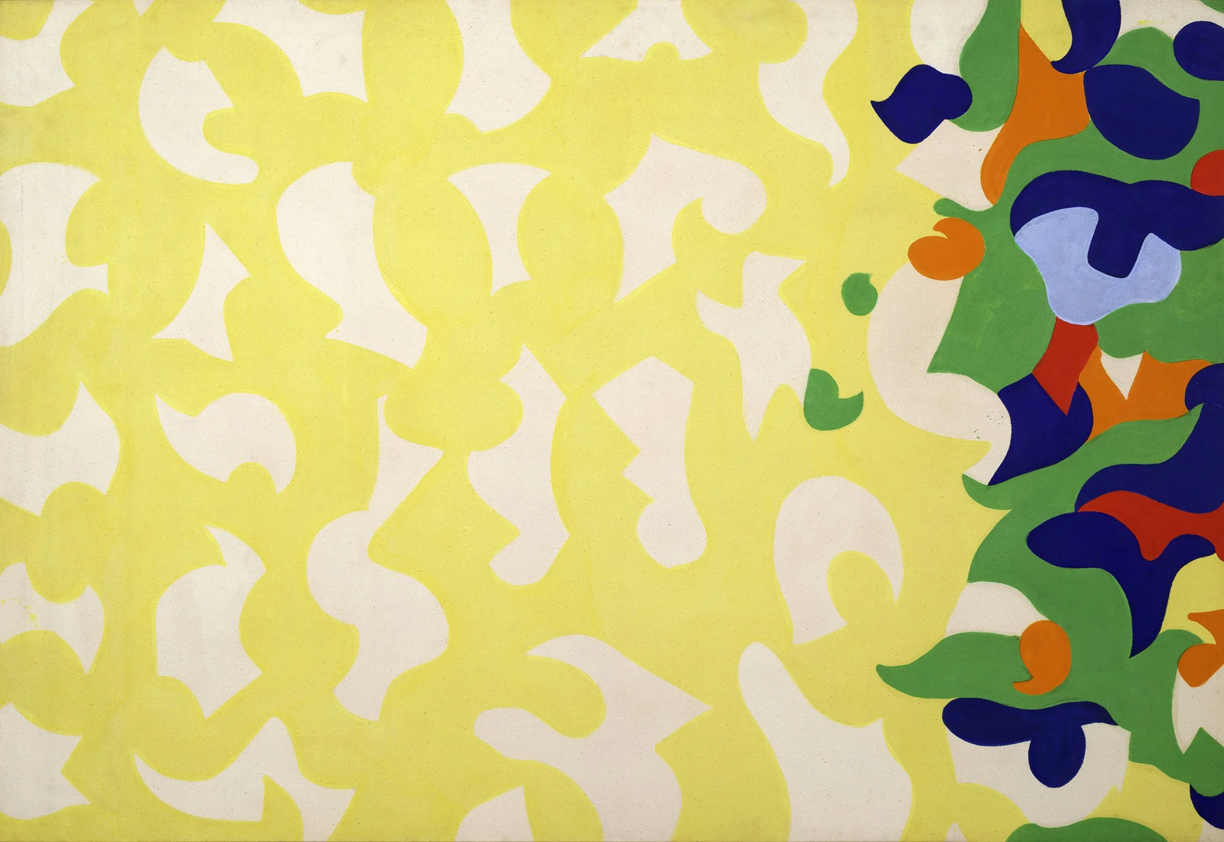
Paul Reed came into his own style in 1962 using interlocking forms based loosely on a grid, first in all-over compositions and then centered on a field of raw canvas. Circular movement was a key element in Reed’s work from 1962 to 1965. In #12, 1962, the earliest work in the exhibition, raw canvas forms float on a yellow field with a mass of colorful forms to one side. The open organic forms of the raw canvas provide light while the multi-colored forms contribute energy to an overall composition that is ordered and balanced. In Barbara Rose’s 1964 article “Primacy of Color,” she states one of the four influences on the Washington Color Painters was an exhibition of Henri Matisse’s late cut-out works at MoMA in 1960. One can see why comparisons to Matisse were made with Reed’s early paintings.
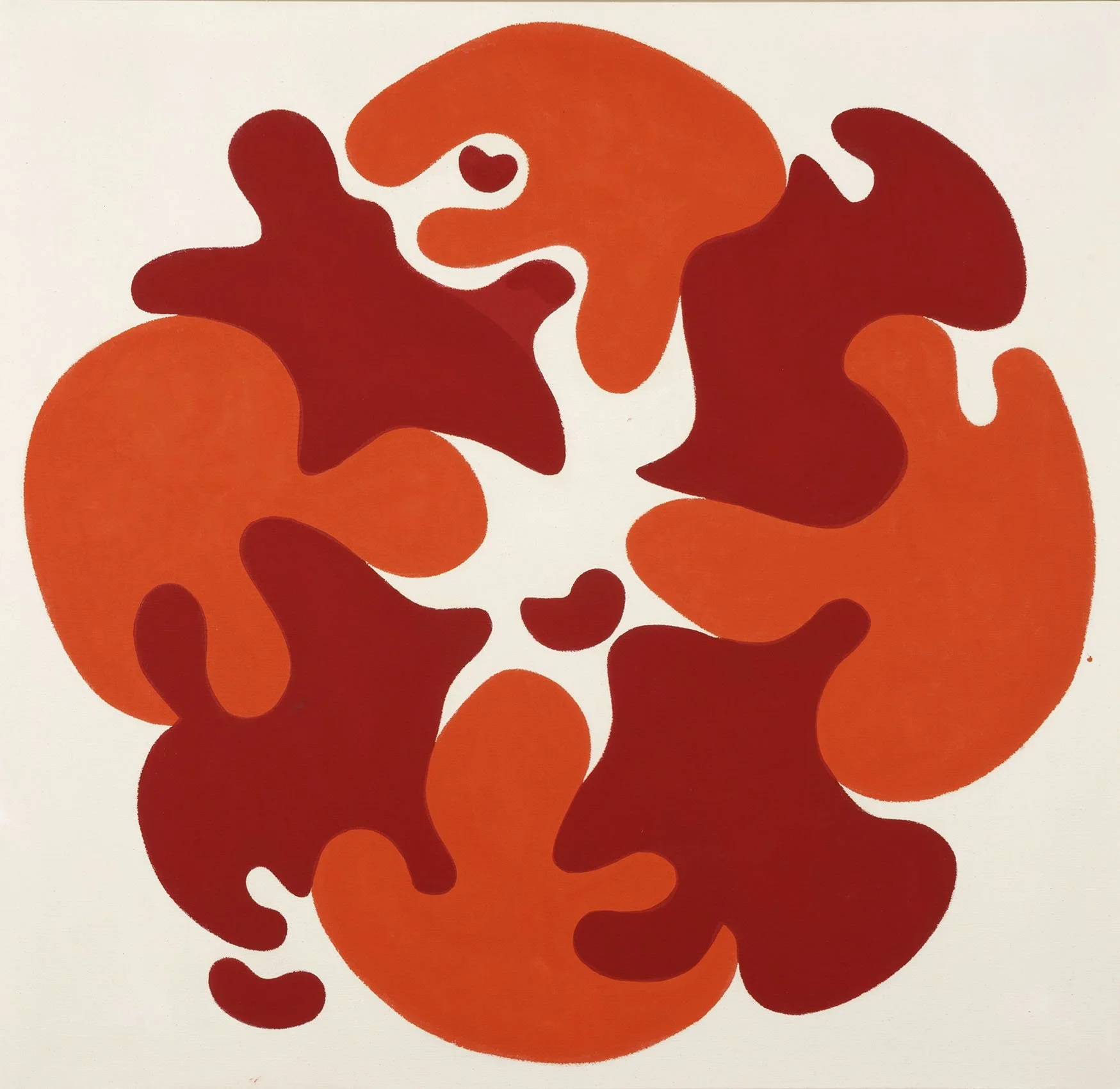
Reed, however, credits another important artist for inspiration. In a 2005 interview, Reed said he was interested in applying Josef Albers’ theory of simultaneous contrast to curved forms to bring together the energy both create. This is evident in #20C, 1963 where the alternating red and orange forms revolve around a raw canvas center. The curved yet crisp edges of the forms draw attention to the circularity and three small offshoots emphasize the active movement. In the introductory text for Reed’s first solo exhibition in DC at the Adams-Morgan Gallery in January of 1963, fellow artist Howard Mehring wrote, “He has chosen a curved energized shape as a vehicle for color, a shape which itself seems to express the properties of color vibration and pulsation….They move and play freely or converge on a center gently touching and overlapping. We catch their joy and their sense of play, their friendliness.”
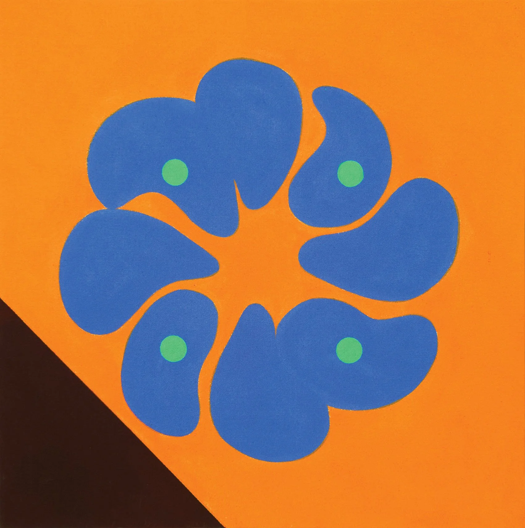
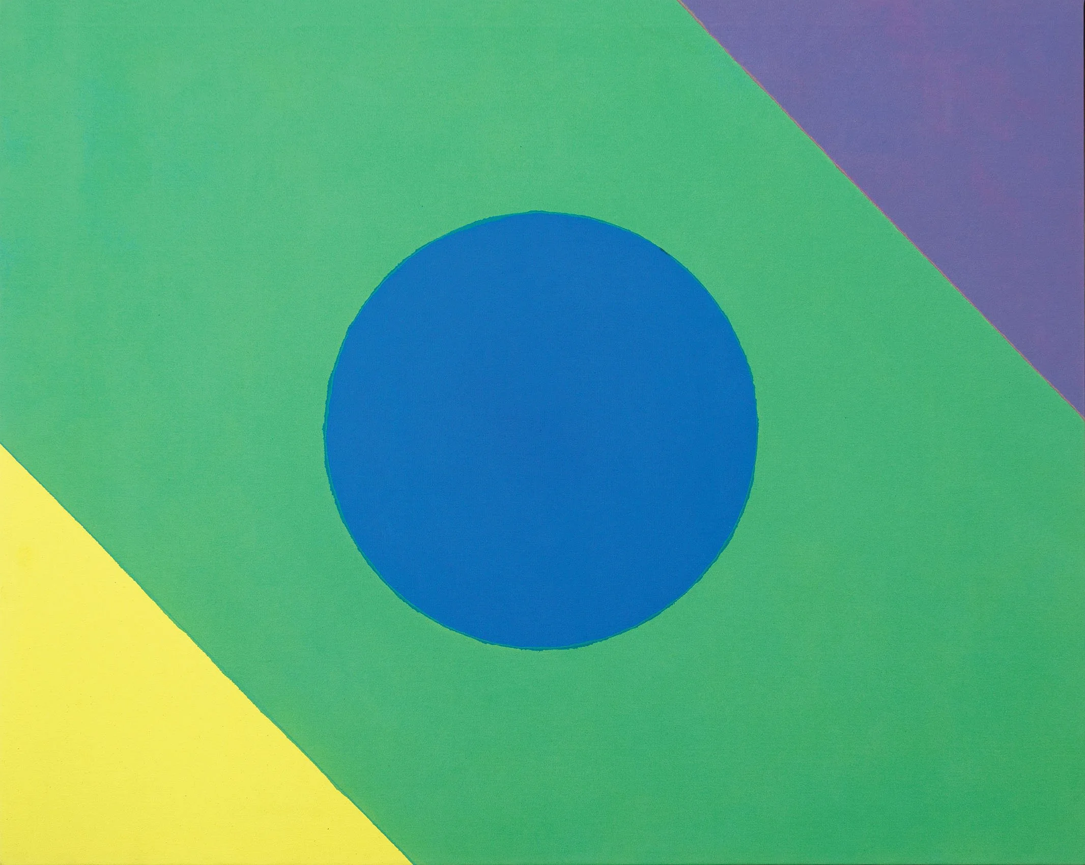
The centrifugal force seen in #20C, 1963 led to the next series, the “Satellite Paintings,” where a single form breaks out of the central painting, whirling away to become a smaller canvas nearby. Seven of the Satellite Paintings, including Satellite Painting #12, 1963 in our exhibition, were featured in Reed’s first New York exhibition, held at the East Hampton Gallery in November of 1963. In 1964 the focus on circular movement shifts to more geometric compositions such as #9 where a flower-like form of eight blue petals floats on an orange field and a triangle of deep eggplant on the lower left provides a foreground to anchor the painting. In Kumquad, a unique composition by Reed, rings of color radiate out from a central green circle. Kumquad provided the idea of a central disk in the artist’s next series, the 1965 “Disk Paintings.” The Disk Paintings mark a change in Reed’s work from the biomorphic to the geometric as Reed became more interested in the transparency water-based acrylic paints allowed.
In 1966 Reed thought about how Jackson Pollock’s use of strong vertical blue lines in Blue Poles, 1952 (National Gallery of Australia) moved his eye across the canvas at a tempo determined by Pollock. This caused Reed to consider how cadences of color guide the viewer, first exploring zigzagging bands of color (Upstart and Interchange) and then grids (Inside-Outside, Intersection, and Coherence). The structure of these compositions provides a simple, direct way for the eye to relate bands of color to the canvas support. This realization led Reed to consider the overall form of the painting and to use shaped canvases to emphasize the power of color.
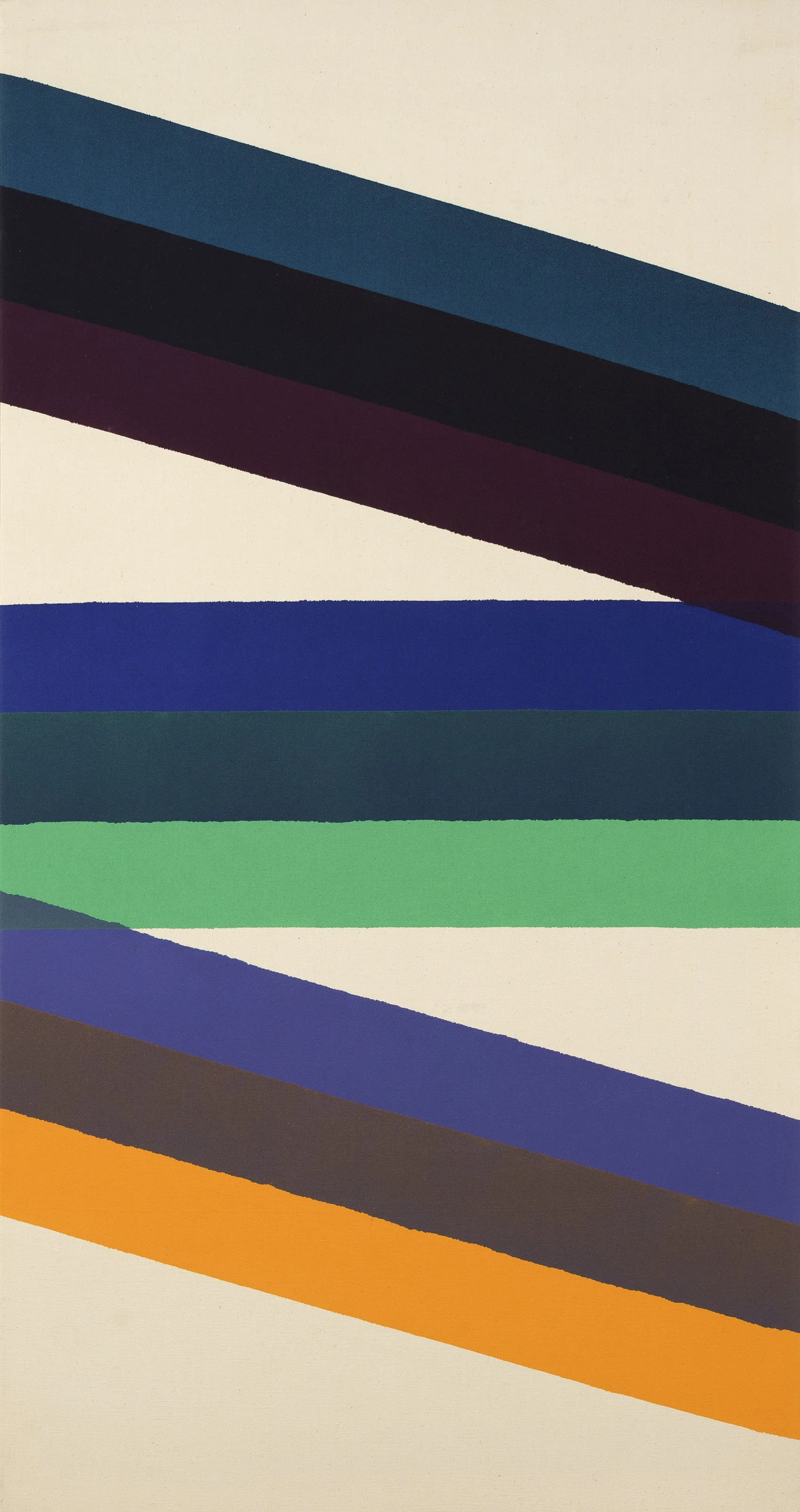
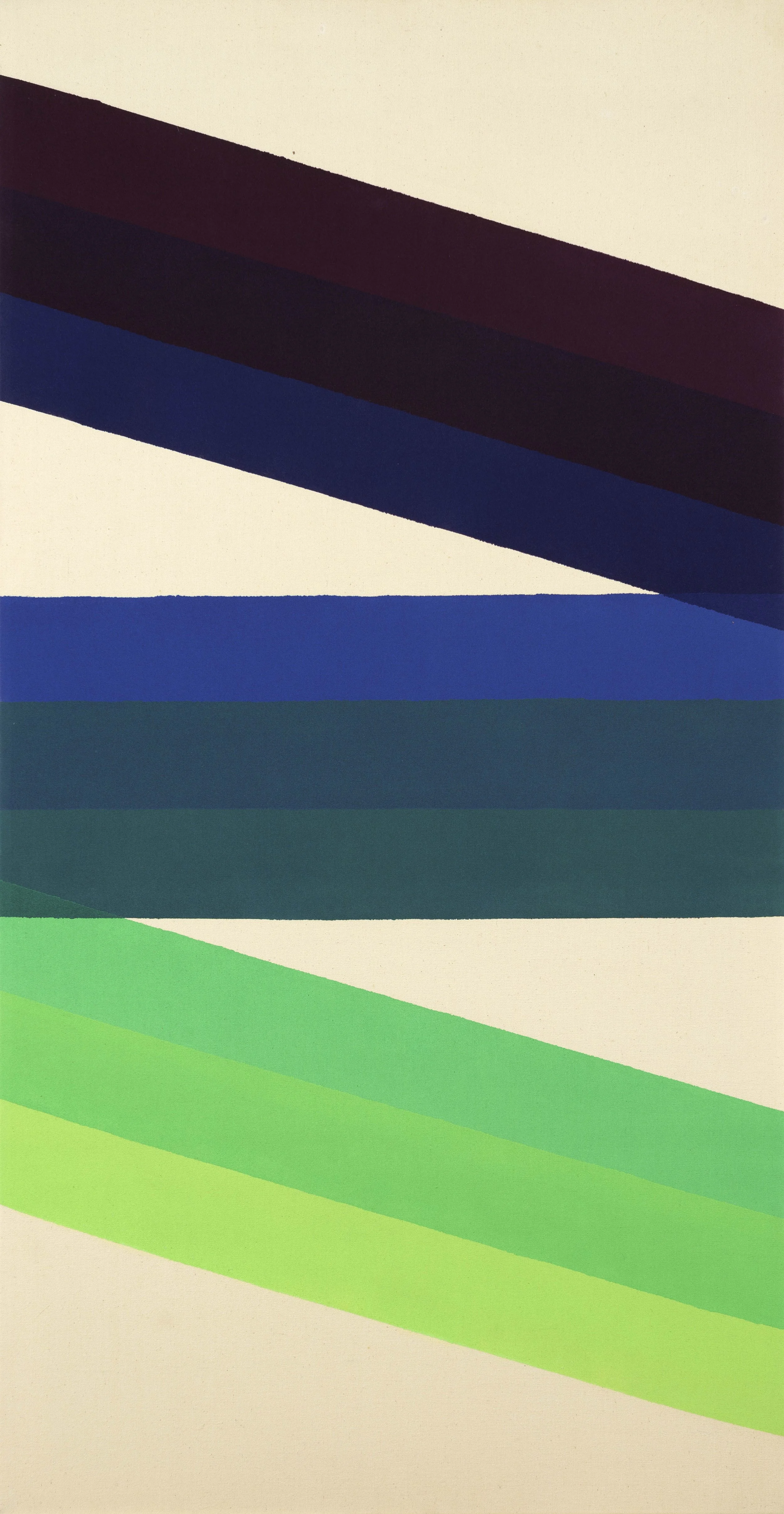
In the Interchange series, bands of color appear to bend as they zigzag down the vertical canvas. In Interchange P, 1966, each band is made up of three colors which shift from deep purples and blues at the top to lighter blue and teal at the center to shades of yellow-green at the bottom. The small overlap of each band at the canvas edge creates the sensation of a bending run of continuous color shifting from dark to light. Reed applies the lessons of bending color to the parallelogram-shaped canvas In-and-Out C, 1966 where the slight overlap of the central yellow bands and the green edges give the painting a sense of ribbons unfurling in a rotating movement.
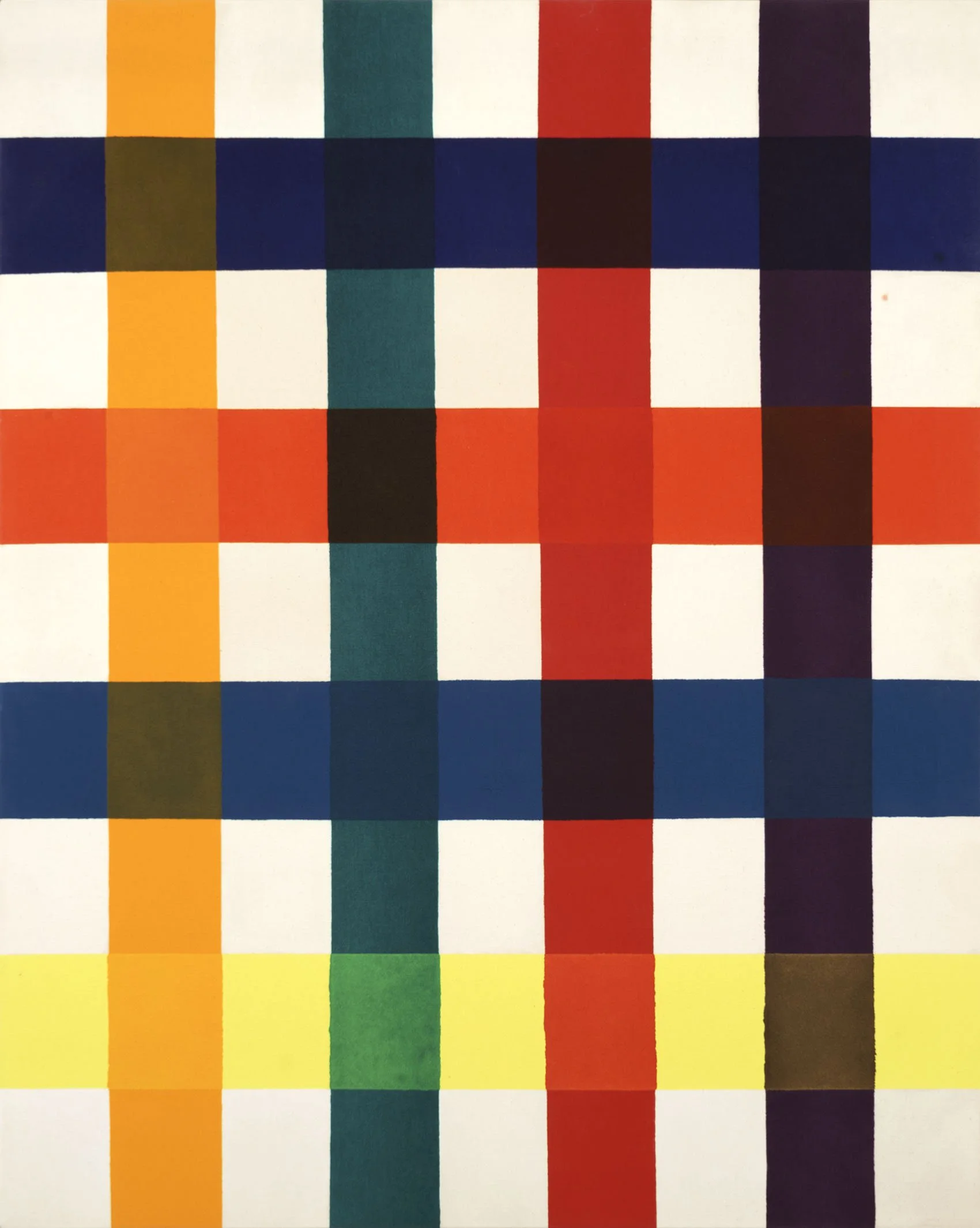
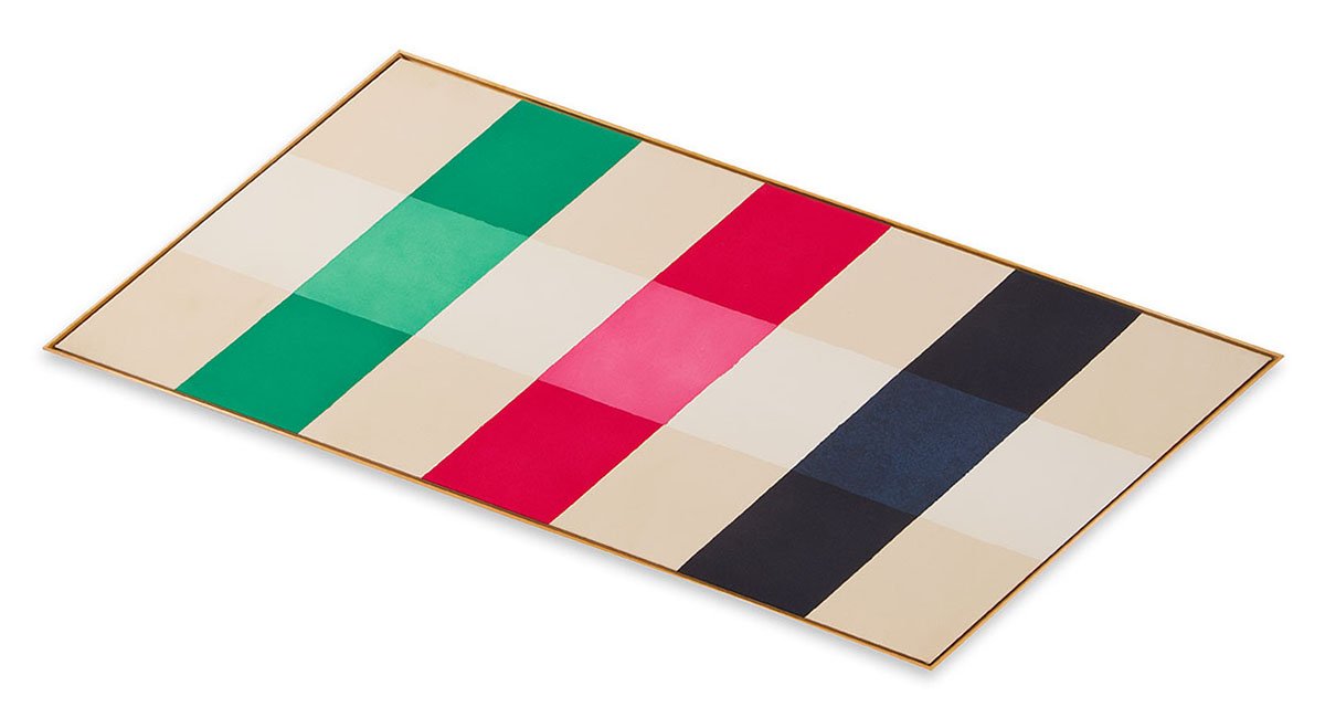
Inside-Outside VII, 1966 represents Reed’s first grid series where he uses a lattice of four bands of colors to produce a grid of 16 colors. The layering results in a variety of earth tones. In the next series, represented in our exhibition by Intersection XII, 1966, Reed opens the lattice to include more raw canvas, giving each color in a grid of blue, orange, and green more space. Reed makes small shifts in the density of the paint to provide one lighter and one darker shade of each color so that the meeting of the two produces a richer toned square. In the Coherence series, which came next, Reed stretched out the grid to focus on one band of intersections. The lessons of Intersection and Coherence led Reed to the lozenge-shaped Emerging series. In Emerging XVII, 1967, a bright orange band bisects three bars in a slightly more muted gradient of red, orange, and yellow. The shift in color value of the vertical bands causes the eye to pulse back and forth along the diagonal.
In 1967 Reed experimented with the overall form of a painting. He drew out shapes to see how color would work when there was no longer a clear central axis. By twisting and pulling his grid to a peak, Reed found his next series, Topeka, a five-sided shaped canvas. Topeka XVIII, 1967 is the final work in our exhibition. In the painting a diagonal band of magenta bisects a stretched grid of green, blue, and raw canvas. The overall effect is color pushing out beyond the constraints of the canvas. Reed was so pleased with the Topeka series, he went on to do increasingly complex shaped canvases from 1967 to 1970. These works were shown in our 2013 exhibition Paul Reed and the Shaped Canvas in the context of shaped canvases created by other Washington Color Painters.
[ TOP ]
Modernism 1913-1950 | Realism of the 1930s and 1940s | Abstraction of the 1930s and 1940s | Post-War | Selected Biographies