Sept 14 - Nov 16, 2018
Read essay here. | Atitst’s Series | Some works may still be available, please contact the gallery at 212-581-1657


Essay by Emily Lenz
For our first solo exhibition for Francis Celentano, we have selected two bodies of work, the Alpha series (1968-1971) and the Electra series (1990-1992) to demonstrate the artist's use of color and structure, often through patterning, to create a unique viewing experience. In the two series, we see Celentano's methodical development for each series, his embrace of technology available at the time, and his ceaseless exploring of the endless possibilities of color.
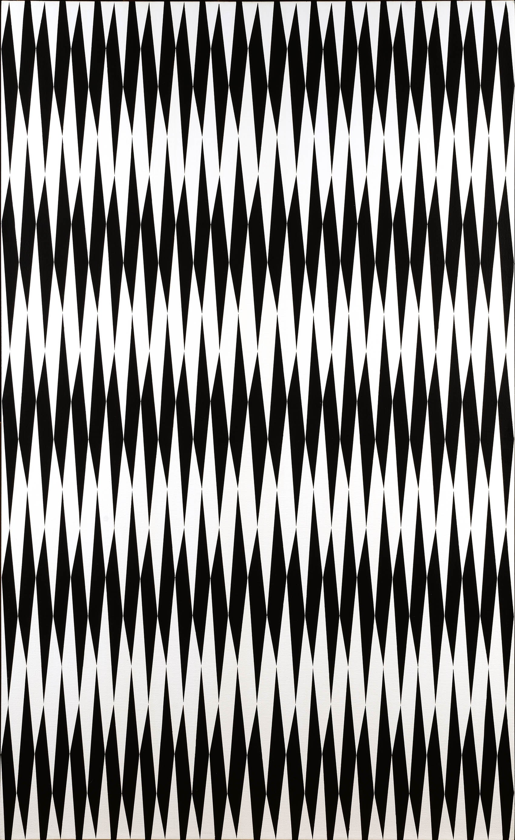
Francis Celentano came to national attention with his painting Lavender Creed, 1964 in MoMA's 1965 exhibition The Responsive Eye, which announced the new international style Op Art. His style at the time, like Screen, 1965, was more Hard Edge than Op with repeating bold forms in subdued colors of navy blue, purple, and black. Celentano wrote that in these works, he desired to evoke a mood using "carefully calculated, premeditated, and visually measured (intuitively)" forms. He found each compositions through small progressive changes in sketches, something he considered a complete rejection of the spontaneous Abstract Expressionist style. Celentano and other Op Art painters' focus on the audience rather than self was considered another rejection of Abstract Expressionism.
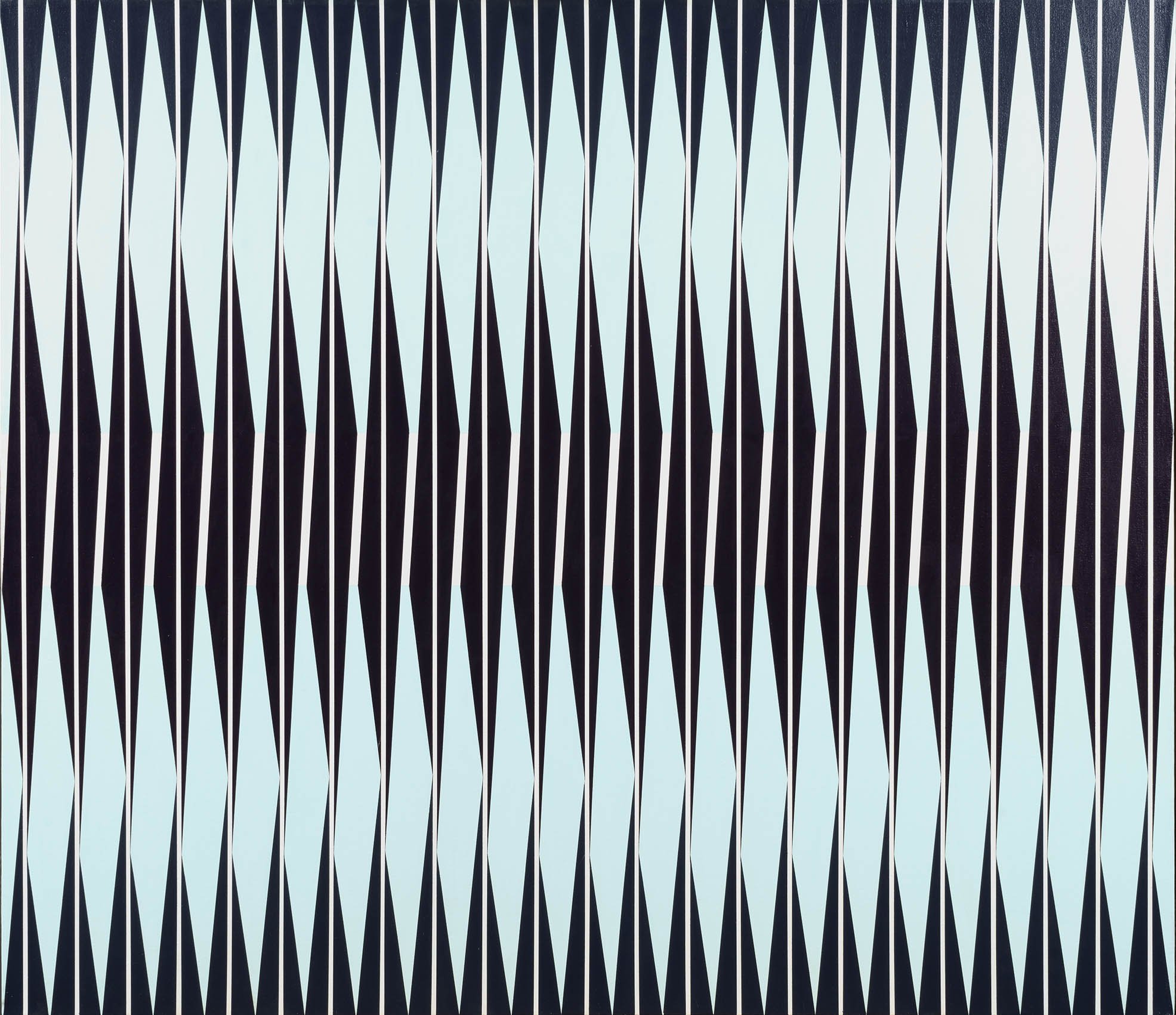
Celentano also used studies to establish a technical approach for every series he did. Screen printing, stencils, and an airbrush were key to his 1960s compositions as computer programs would later be. Celentano embraced available technology to assist him in executing his vision. This was noticed and his New York dealer in the 1960s was the Howard Wise Gallery, known for its focus on art and technology. His paintings were, in fact, support for the first computer-generated art exhibition, organized by the Howard Wise Gallery in 1965. The importance of screen printing in the Op works can be seen in a collage study for Zilos, 1966. Celentano first created a screen print of a row of increasingly larger black triangles which he then collaged in mirrored, rotated, and repeated strips to find his composition. He scaled up his study for the painting using stencils to maintain the crisp edges of the intricate arrangement.
An important step in Celentano's development was his participation in the International Artists' Seminar in 1965, where he got to know Polish artist Wojciech Fangor (1922-2015). The program, held at Fairleigh-Dickinson University in New Jersey, brought international and American artists together in a residential program for the exchange of ideas about new artistic practices. The focus of the 1965 seminar was Op art and ten artists were selected, including Celentano, Fangor, and the Paris-based Groupe de Recherche d'Art Visuel (GRAV) artists Yvaral (1934-2002) and Horacio Garcia Rossi (1929-2012). Half of the artists had been in MoMA's The Responsive Eye exhibition earlier that year. Vasarely wrote the opening text for the traveling exhibition of works made at the Seminar. He called for Op art to be the art of the time, to reflect the new knowledge that emotions were the result of biochemistry and the experience of art was no longer felt in the heart but through the retina. Most impactful for Celentano was seeing how Fangor's gradient transitions of sprayed color and the resulting color pulses provided an alternative to the severity of Op's black and white contrasts. The work Celentano created during his residence at Fairleigh Dickinson and his subsequent work for the next two years remained classically Op, like Zilos, 1966, but the idea of painting sensuous color was percolating.
In his kinetic paintings from 1967-1968, Celentano used drawings and collage to determine the progression of black ellipses on a white circular canvas that would have the desired effect of warping and undulating when rotated by motor. In the kinetic paintings, Celentano felt he had created "a viable, physical presence in which the spectator responds more to the whole and less to elemental parts." The viewer seeing a work as the whole was one influence that encouraged Celentano to investigate pure color as a controlled experience.
Celentano found his third influence for color upon moving to Seattle, where he accepted a position at the School of Art at University of Washington in 1966. Celentano was hired by Spencer Moseley, director of the School, who was interested in M. E. Chevreul, the 19th century theorist who held that the juxtaposition of two complementary tones heightened both their intensities. Chevreul's writings, Fangor's soft approach to Op, and his own desire for his paintings to be experiences led Celentano in 1968 to formulate his own strategy for color.
The Alpha Series, 1968-1972
For the Alpha series, Celentano used vertical sequences of color bands in a horizontal format with alternating stripes of gradient and uniform color. He used an airbrush, a popular tool for artists at the time, to soften the many color transitions within a single stripe. The striped structure holds the color while the interaction of sprayed saturated colors creates dramatic tension. With continued looking, the stripes disappear and waves of color ebb and flow in the viewer’s space. With close looking, the viewer's eye cannot pin the color down. Instead the color shimmies across the canvas as even the crisp edges of stripes blur. The lively color zips back and forth across the highlighted horizon evident in each work, like the streak of vibrant red in Alpha Blue, 1969.
All of this is achieved through Celentano's meticulous technique. In the Alpha paintings, Celentano first sets down vertical stripes of a single color or white. Next Celentano used an airbrush to spray gradations of high-keyed color in an even and consistent surface on every other stripe. He used a watered down paint to allow the white gesso underneath provide additional luminosity. So seamless are Celentano's transitions from green to purple to red then yellow and back again in Alpha Prime, 1968, it is difficult to sense which colors were laid down first. The result is shimmering color that expands beyond its structure. In Alpha Prime, particles of green paint at top and bottom melt into the purple next to it, as if the viewer is falling down the stripe into a hot yellow center. Celentano's choice of airbrush to apply the paint in very fine particles of pure color adds to the sense of the painting as an atmosphere rather than an object. Unlike most Op artists, Celentano frequently worked with the rectangular canvas rather than the square. This heightens the experience for the viewer as the shape mimics the field of vision, resulting in color extending beyond viewer's peripheral vision.
The Electra Series, 1990-1992
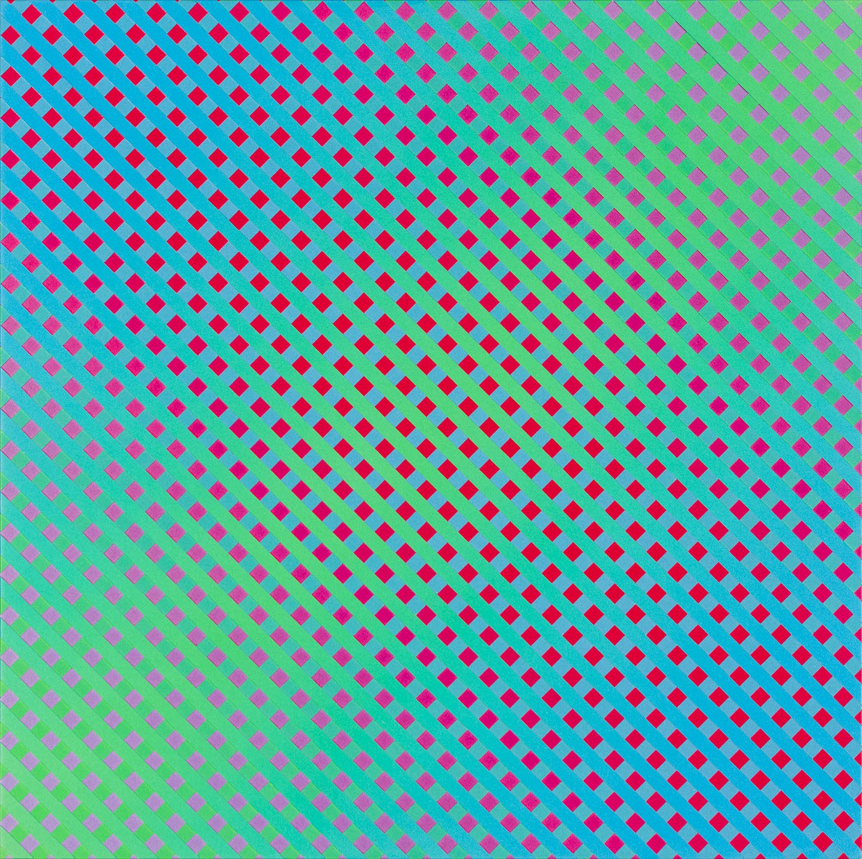
The 1990s brought the age of the pixel with the expansion of personal computers. Imaging programs improved immensely, like Targa, an early version of Photoshop. In the late 1980s, computer monitors went from displaying about 30,000 colors to nearly 17 million. Celentano, not shy about using technology, set out to see how the computer could help him. For Celentano the particles of color in his Alpha paintings became pixels in his Electra series. He used the computer program to generate colors within an array of squares on a continuous ground. He selected four colors for the pattern and one as background. Two colors were in the same tone as the background and two in sharp contrast. He arranged the colors into units of four squares, which he flipped and mirrored to create a larger unit of 16 squares which he repeated throughout the composition. The act of mirroring, flipping and repeating recalls Celentano's Op paintings. He also used the program to determine the scale of the squares to the background color, as he was interested in how a viewer's distance effects the reading of a painting.
Once Celentano had settled on a color arrangement and scale, he applied the colors selected on the computer monitor to paint on canvas. He created the grids by taping out 1/4 squares in the case of Electra #10, 1991 or 3/16 squares in the other Electras. Only after removing the tape from the canvas could Celentano see if his computer studies translated to traditional materials. The effect is dazzling. The viewer perceives a pattern but the colors trick the eye, resulting in random light pulses and seemingly endless paths through the painting. From across a room, the Electra painting look like a single field of color, difficult to hold down but overall the background color dominates. Moving closer, the viewer sees varying lines such as diagonals, zigzags, and more complicated paths moving through the image, the result of the mirroring and reversing patterns. Up close, the viewer discovers the lines and dots are in fact pixel-like patterns of squares in four colors. Here Celentano allows the viewer to understand the mystery of the color interactions that creates the sense of an electric field with infinite movement.
Celentano's work across six decades considered in an intellectual, structured approach the emotional effects of color, its sensuous qualities. By identifying patterns and economic ways to execute intricate paintings, Celentano continued to find new series to expand his understanding of color and its effect on all of us. Critic Suzi Gablik said of his paintings, "Color is an event, not a fact." In both the Alpha and Electra series, Celentano makes this clear.
[ TOP ]
Modernism 1913-1950 | Realism of the 1930s and 1940s | Abstraction of the 1930s and 1940s | Post-War | Selected Biographies