September 4 - November 8, 2024
Installation Views | Essay | Artists in Electric Op | For availability and pricing, call 212-581-1657.
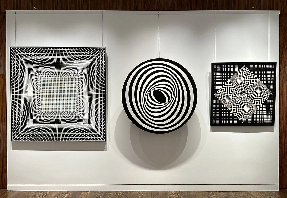
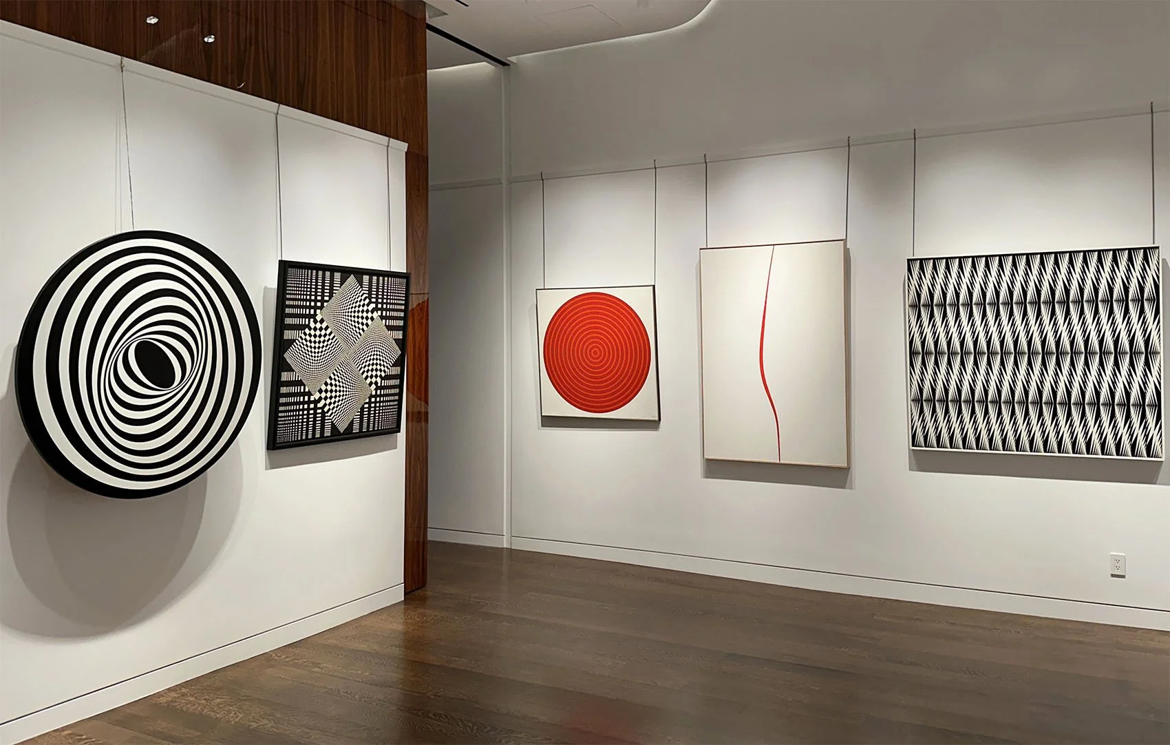
Installation Views
Essay by Emily Lenz
Our gallery first exhibited Op art in 2005 because we saw its importance as a connection between the pioneers of geometric abstraction in the 1930s and contemporary art. In today’s digital, installation, and interactive art, we see Op’s influence in the engagement of the viewer as it was the first movement to explore new understandings of the psychology and science of perception. Many Op artists were trained by Bauhaus teachers or influenced by international Constructivists so they combined traditional methods of painting and sculpture with developments in materials, particularly plastic, to achieve new crispness and light. Op art had a role in the shift from art as object to art as experience that remains relevant today.
Our gallery exhibition supports two museum exhibitions that will look at Op art’s relationship to the computer: Electric Op at the Buffalo AKG Art Museum (September 27, 2024 – February 3, 2025) and Electric Dreams at the Tate Modern, London (November 24, 2024 – June 1, 2025). These exhibitions will focus on how Op art set the foundation for programmed and digital art. Both exhibitions will consider how the use of mathematical principles, motorized components, and new industrial processes like Plexiglas, by the Op artists set precedents for experimenting with digital technology in the 1970s and 1980s using early computing systems.
The first American exhibition of computer art Computer-Generated Pictures included black and white prints by engineers A. Michael Noll and Bela Julesz. It was held at the Howard Wise Gallery in 1965. Our artists Francis Celentano and Bill Komodore were represented by the Wise gallery, having their first exhibition there jointly in 1964. During the computer exhibition, Celentano’s hard edge paintings hung on the surrounding gallery walls suggesting an early affinity between Op and digital art. The 1968 exhibition Cybernetic Serendipity: The Computer and the Arts at the Institute of Contemporary Arts in London was the first international exhibition of computer art. 60,000 visitors came to see computer-aided creative activity in visual art, music, poetry, dance, sculpture and animation. The exhibition traveled to the Corcoran Gallery of Art in Washington, DC and the Exploratorium in San Francisco. In 1970, the Jewish Museum held the exhibition Software – Information Technology: Its New Meaning for Art. It included the work of conceptual artists John Baldessari, Nam June Paik and Lawrence Weiner among others. These exhibitions introduced the potential of computers in art.
In 1960s, the idea of programmatic thinking was more on artists’ minds than actual computer use. Computers were still institutional; artists accessed university computers after-hours or paired up with corporations through projects like Billy Kluver’s Experiments in Art and Technology (E.A.T) launched in 1967 and LACMA’s Art & Technology Program. Art was programmed in terms of artists setting up systems whereby a work could be reconstructed if the same rules were followed, but much of the work was done by hand or simple motors.
The works selected for our gallery exhibition demonstrate the use of systems, patterns, and light to investigate perception. Each artist in our exhibition might use systems, patterns, and light, but we have placed them into the category we think most essential to their work.
System
1.a set of things working together as parts of a mechanism or a interconnecting network.
2. a set of principles or procedures according to which something is done; an organized framework or method.
In our exhibition, three of the artists Tadasky, Gene Davis, and Leroy Lamis built systems that hypothetically could be replicated through simple instructions. However, the artist’s individual skill was required for execution. For example, Lamis received a commission to make 13 New York State Council for the Arts prizes in 1970. Unable to find any fabricator to his liking, he made each by hand. A basic framework allowed for a deeper investigation of color with each subsequent work. Davis’s stripes act as containers of color to test out daring color arrangements that defy color theory. In Tadasky’s concentric circles, he investigates movement, depth and dimension. They achieved a machine-aesthetic though all were done by hand.
Our exhibition includes Tadasky’s MA-105 made shortly after he arrived in New York from Japan in 1961. It shows his early interest in dimensionality and predates Tadasky’s system of perfect circles contained within a square canvas, as seen in C-185, 1965. Tadasky used fine Japanese brushes and a turntable for these later works. While Tadasky’s paintings appear to have mechanical precision, the slight wobbles of the rings give the painting a distinct vibration and energy.
New technologies are best introduced in simplified forms with few functions and Op artists often worked the same way. Many worked out compositions in black and white since color adds its own dynamics and interpretation. This allowed a focus on movement using positive and negative space, without color adding another element of push-pull.
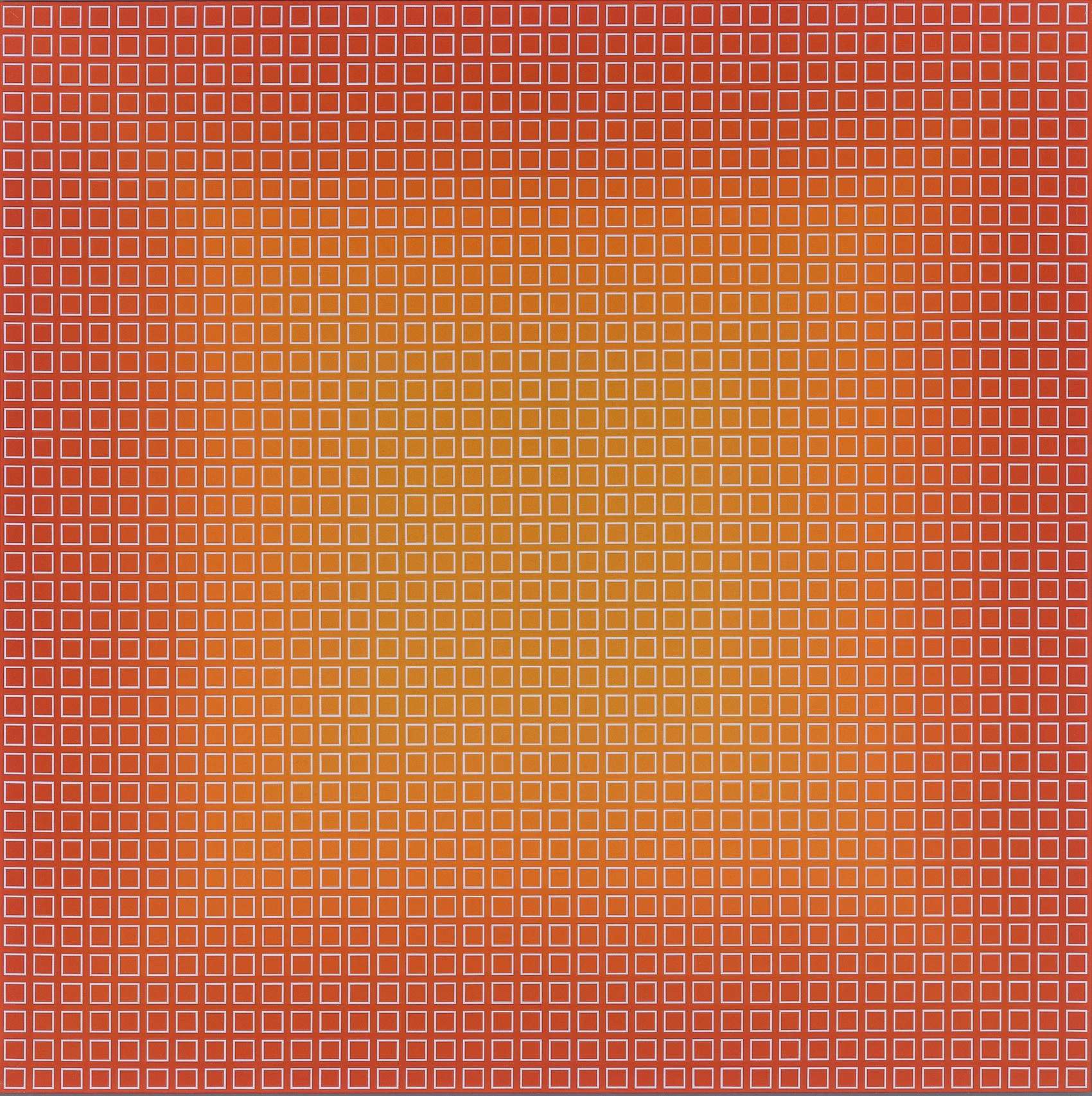
Francis Celentano moved from Hard Edge into Op through black and white works. From 1965 to 1968, he manipulated opposing black and white shapes to work out “visual destabilization” in his paintings. Our exhibition includes Elliptical Kinetic Painting, 1967, one of the five kinetic paintings Celentano made. Another is featured in the Albright-Knox exhibition. In them, Celentano experimented with an arrangement of concentric ellipses bounded by a circle. He used studies and collages to find the exact arrangement of his composition. To radiate a specific pulsing rhythm for each kinetic work, he designed, constructed, and timed the motor. In 1990 Celentano used Targa software to map out varied arrangements of small squares of color in the Electra series. Up close the squares resemble pixels and work in the same way creating an overall field of glowing uniform color when the viewer steps back. One of these works is also in the Albright-Knox exhibition.
In the early 1960s, three artists, Frank Hewitt, Ernst Benkert and Ed Mieczkowski, formed The Anonima Group in Cleveland to investigate the psychology of perception. They set a program of limits for each project that the artists explored separately. This demonstrated the characteristic problem of the painter who was to produce with the same materials something different each time. The instructions for their 1965 project also served as the title for their exhibition Black/White and Gray 24” Square. Each artist contributed ten paintings for the New York exhibition that traveled to the Institute of Contemporary Arts, London and Galeria Foksal in Warsaw in 1966. Pursed and Munchin Henries were part of this project. While the artists were programmatic by setting shared limits on their work, the parameters of each project led to a variety of colors, patterns, and arrangements in their paintings.
Another part of systems is the inherit structure they can give a work. Both Frederick Hammersley and Leroy Lamis were minimal in their use of colors and more interested in form. Lamis was limited to the available colors offered by Plexiglas in his concentric cubes sculptures and Hammersley preferred to work in two or three colors. Both adopted early computing which could demonstrate process and shape but came up short on color.
Our exhibition includes the painting Sanforized which Frederick Hammersley discussed in the MIT journal Leonardo focused on the use of science and developing technologies in the arts. Hammersley wrote in the April 1970 issue: "The title Sanforized means preshrunk and suggests stability. At the same time, there is a switch of positions in the parts. Usually at first the black squares appear on top of the white. And then, the white can appear as if it were on top of a black field. There is a third shift in emphasis: the central vertical row of squares can appear as a column across which there are three horizontal white bands, the ends of which are black squares." Hammersley took advantage of our unstable reading of black and white to create movement within a restrained composition. Hammersley was introduced to Art1, an early program for making art using a computer, when he began teaching at the University of New Mexico in 1968. He made many computer-generated drawings from late 1968 to early 1970. Screens were not yet part of a computer set up so images were generated through plotters where an armature moved across a surface as it was fed data. This resulted in early computational art being inevitably geometric.
In the late 1970s Leory Lamis started using computer software to activate his cubes into progressions of color, pattern and transparency. He exhibited his software programs as an installation of computers and monitors on metal bases he painted and designed. Once he got an inkjet printer in the early 2000s, he printed screenshots of his programmed drawings to record them for the long term.
Pattern
1. any regularly repeated arrangement, especially a design made from repeated lines, shapes, or colors on a surface.
2. a particular way in which something is done or organized, or in which something happens.
To some extent all of the artists in our exhibition use pattern. We distinguish patterns from systems for the artists whose compositions change from one to the next. Our system artists still used the viewer’s tendency for pattern recognition. For example, Gene Davis used the viewer’s expectation of pattern to activate his paintings with unexpected colors bright colors to add rhythm and juxtaposition. In Black Staccato, c. 1965, turquoise, lime green, pink, and orange add beats of vibrancy in an arrangement of black, gray and blue stripes.
Margaret Wenstrup studied art in New York with Ralston Crawford in 1953. She returned to Cincinnati and began to work in geometric abstraction. In Whirligig, 1964, she layers patterns in paint. Against a backdrop of woven black lines, four square twisting units make up a central diamond. Combining her art training with her interest in the folk art of quilts and weaving, Wenstrup developed her own form of Op art before its popularity spread in 1965 when the Museum of Modern Art’s Responsive Eye exhibition traveled.
Bill Komodore used repetition of forms to create movement and animate a flat matte surface. He explored the tension between the center and edges of a canvas to draw attention to its surface as a dynamic space of indeterminate depth. Komodore addressed this by creating a single central field activated by the contrast of light and dark along the canvas edge as seen in Ten Ten Fifth Avenue, 1967. Komodore explores the ambiguity between movement and stillness and closed and open spaces in an overall minimal composition.
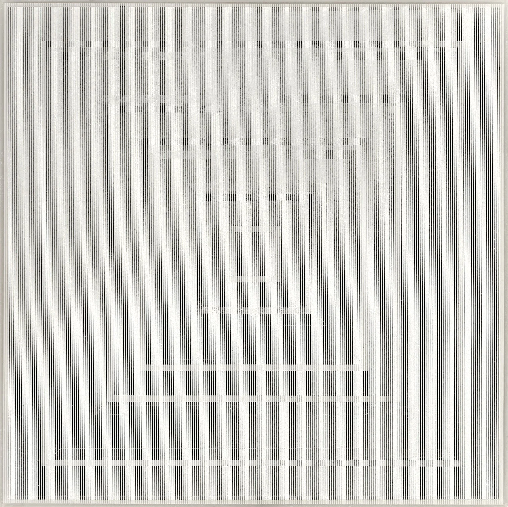
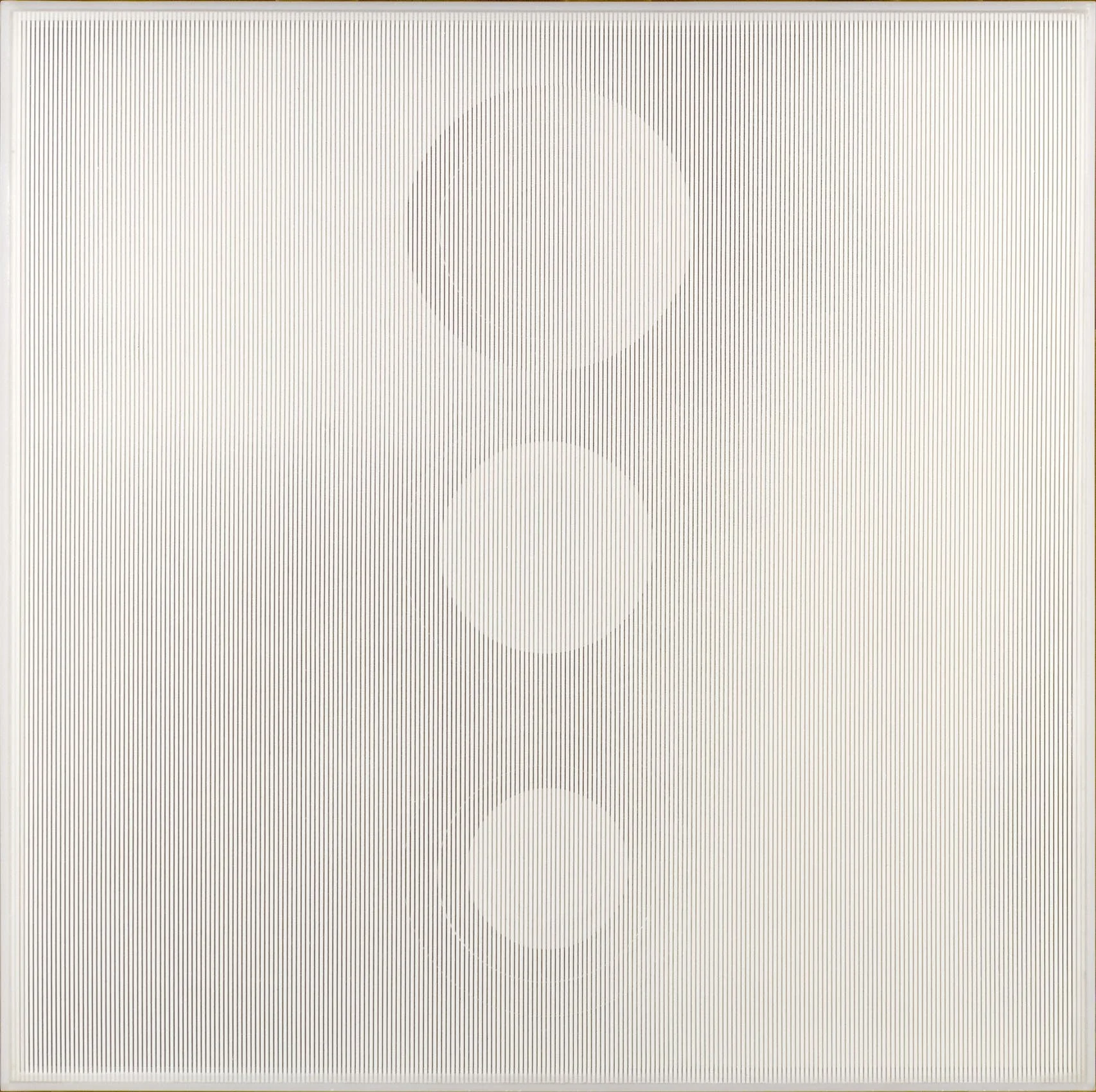
Both Mon Levinson and Reginald Neal used screen printing for its efficiency and uniformity for their materials, maximizing their ability to explore the effects of patterns. The transparency of Plexiglas allowed both Levinson and Neal to investigate the moiré effect caused when two sets of parallel lines overlap. The resulting simulation of movement occurs as the viewer’s sightline changes, generating new patterns as the eye unconsciously ties together new points of intersection. In 1964 Levinson started to make Plexiglas construction in black and white to examine how the intensity of the moiré effect could be controlled by the width, tone, and distance between the sets of lines. He investigated this with a series of geometric construction between 1964 and 1967 including Passing the Squares, 1966 and Switched on Squares: Stacked, 1966. In the 1950s Reginald Neal was an established artist and printmaker credited with advancing the development of color lithography. In 1964 he started cutting his prints into arrangements of symmetrical patterns, incorporated color by working in colored inks for his lines or incorporating different colored plastics as the backing. The efficiency of screen-printed lines allowed Neal to experiment more easily with the patterns and color changes.
Light
1. something that makes vision possible
2. the sensation aroused by stimulation of the visual receptors
Artists have always used new technology to achieve their vision, such as the camera obscura for Vermeer or the portable Kodak Brownie for the Precisionists. By the 1960s both the Second World War and the Space Race produced new technological processes and materials. This opened the door to exploration of both real illumination and implied light through color theory. Our Op artists use both real and perceived light. The high contrast of black and white can create flashes of yellow or blue more luminous than a painted color can achieve. The sculptor Leroy Lamis chose Plexiglas for his material because of both its translucency and its distinct way of transferring light through its edges.
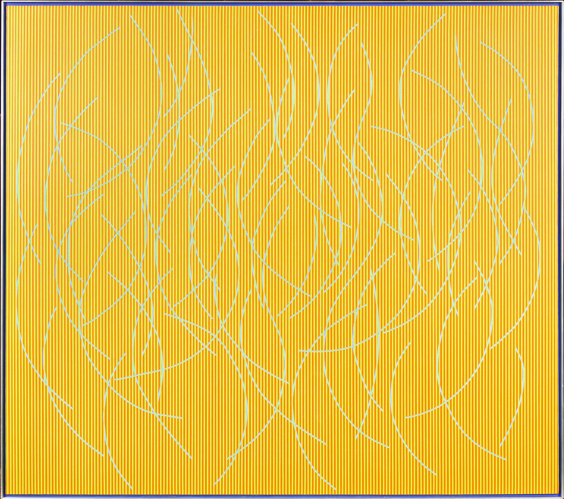
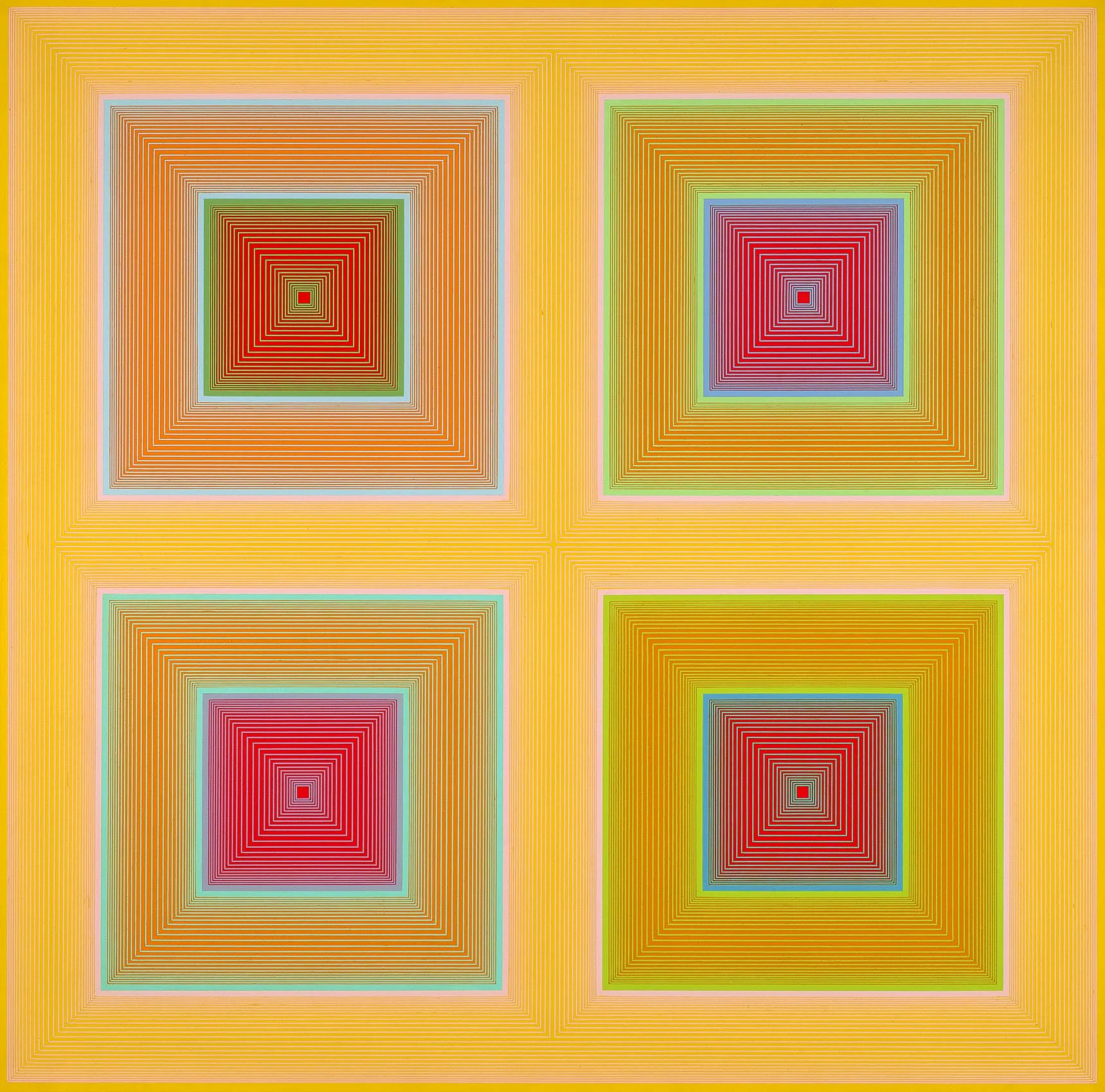
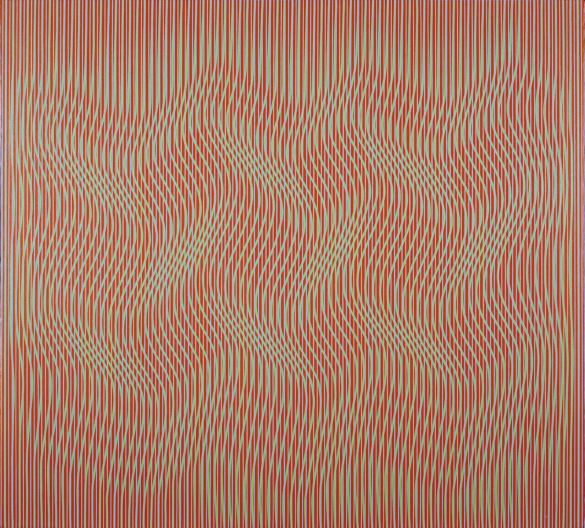
Richard Anuszkiewicz and Julian Stanczak studied with Josef Albers at Yale and expanded on his color theory to create works that show how we perceive color. The reading of light in their paintings transfers a flat surface into an environment or experience. Anuszkiewicz applied Albers’ theories on color interaction to measured, geometric compositions of precise linear patterns within gridded or square formats. In Intra-Yellow, 1970 he made four central red squares appear different colors because of their neighboring colors. The contrast of high-keyed colors creates a vibrational glow that hovers beyond the canvas surface. In Fenced, 1966, Anuszkiewicz pinched and expanded the sense of space by changing the density of the white lines on a black field. The result is a center square that seems to emit light as it either recedes or projects depending on the viewer’s reading. Stanczak is unique within the American Op artists for his use of curved lines to provide organic rather than geometric movement. His paintings radiate energy and internal illumination. In Permutation, 1967, the repeated wave motion comes from shifting curving green lines along a path of consistently wide red and blue lines. Stanczak’s method of taping allowed him to examine how the density of lines produced the sensation of measured space and unlimited movement. The high contrast of actual color versus the impression of overall color the viewer sees gives the painting luminosity and dimension beyond its edges. Hannes Beckmann studied at the Bauhaus from 1928 to 1932. Like Albers, Beckmann works in oil, a difficult medium for achieving crisp lines. In The Wave, he conveys a twisting movement by making tonal shifts in color from the dark exterior into light center. Once Beckmann came to the US in 1948, he worked as a photographer at the early Guggenheim. In his paintings, he transforms the light and dark tones of the black and white camera into color.
Mon Levinson is the only artist in our exhibition who worked with actual light, working with electroluminescent panels developed for landing planes in the Pacific during World War II. His studio was near Canal Street where he saw the commercial use of plastics for sign making and lighting. Attracted to its transparency and luminosity, Levinson began working with plastic around 1960. Exchanges with manufacturers provided him with experimental materials. In Light Diamond, Levinson backs the construction with one of these lighting sheets and paints out much of a Plexi sheet on top of it. Light comes through the edges of Plexi in the center which glows brightly. Levinson was included in the E.A.T. (Experiments in Art and Technology) 1969 exhibition Some More Beginnings at the Brooklyn Museum. There he exhibited a Plexi construction with an electroluminescent panel like Light Diamond in our exhibition. No engineer was involved and it was one of the few pieces that worked throughout the run of the Brooklyn Museum exhibition.


