Feb 20 - May 8, 2020
Essay | Installation | Biographies | Contact the gallery at 212-581-1657 for availibility and pricing.


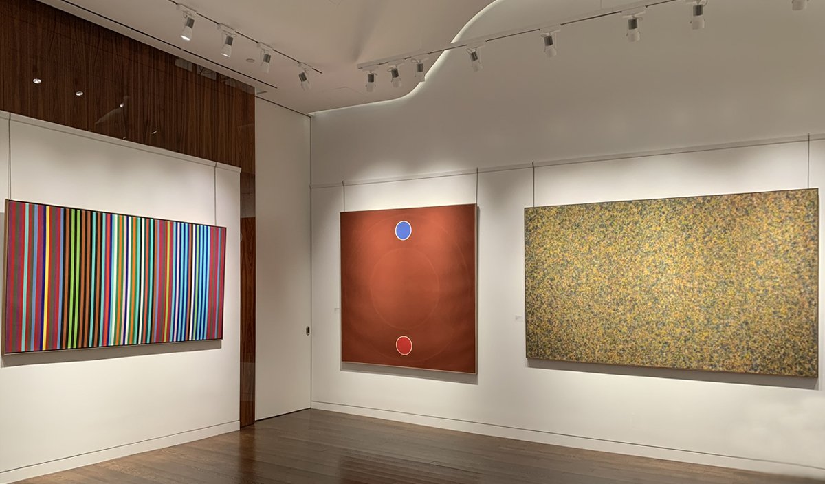
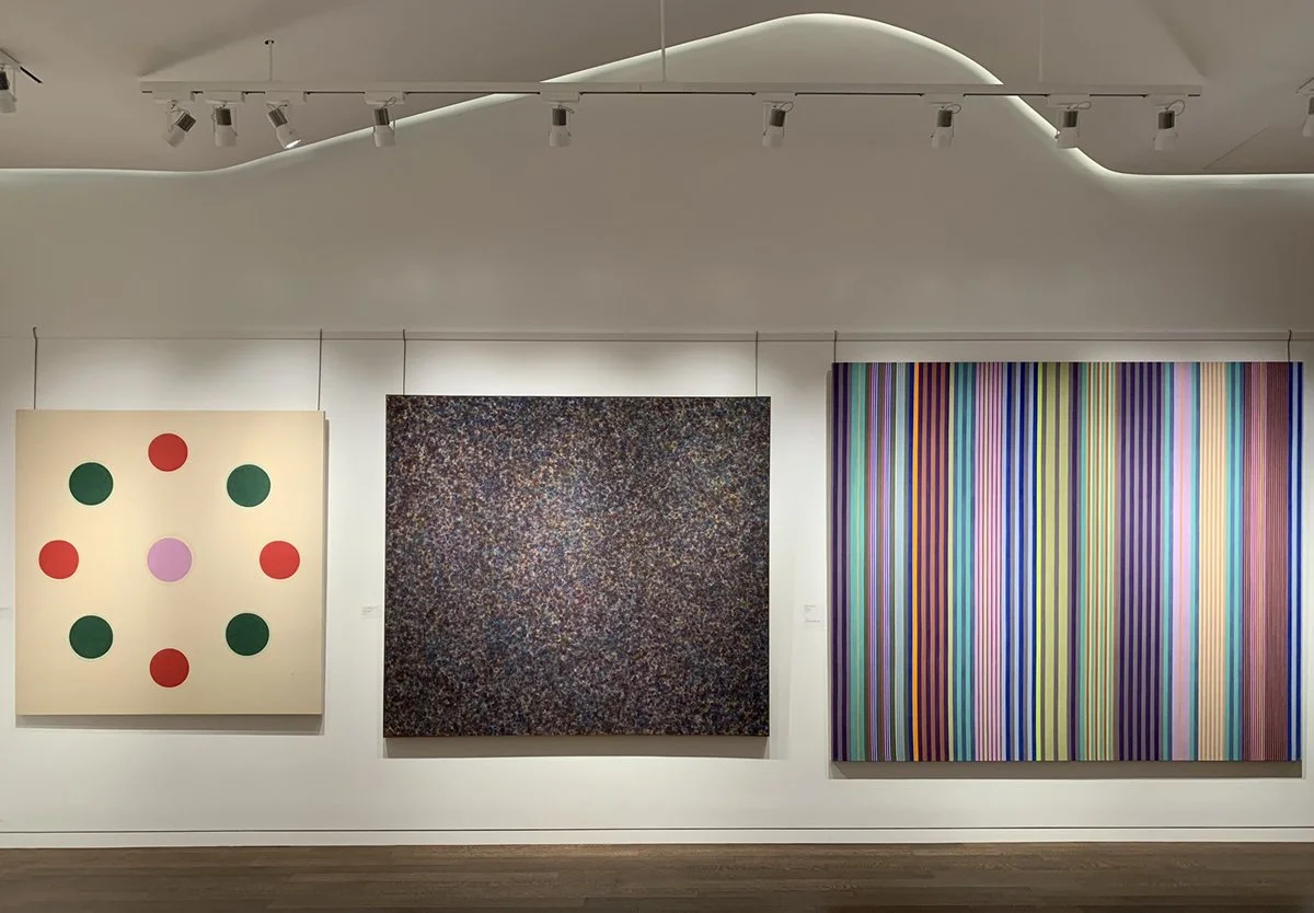
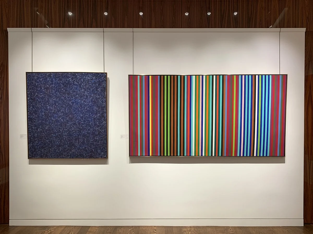
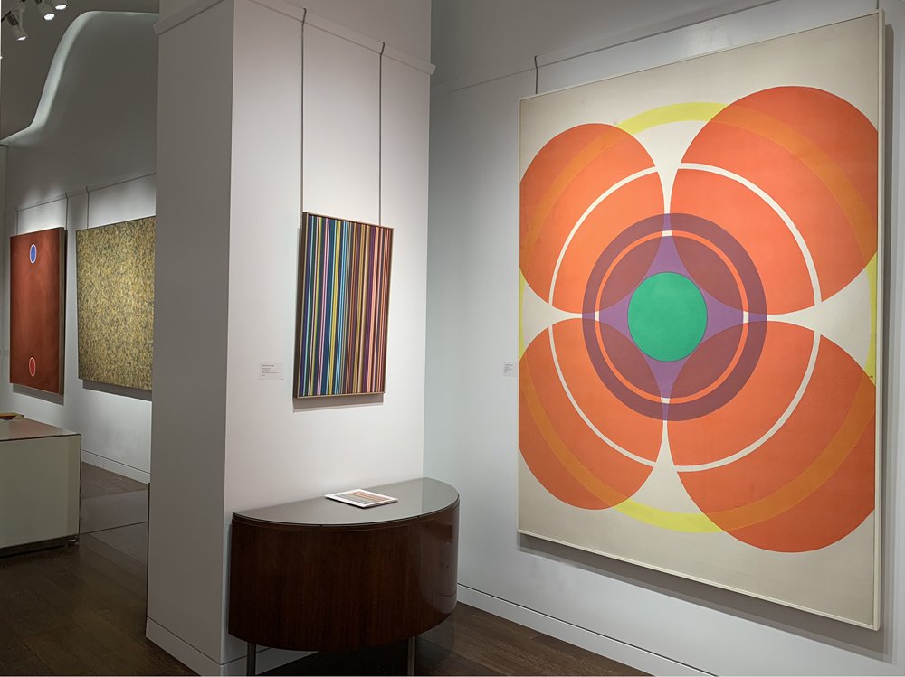
Installation Views
Essay by Deedee Wigmore
The Washington Color School was a group of artists connected by location, materials, and style. Their distance from New York allowed them to experiment with an opening up of color using new acrylic paints stained into raw canvas that broke with the heavy gesture of Abstract Expressionism. Morris Louis (1912-1962) and Kenneth Noland (1924-2010) met while teaching at the Washington Workshop Center for the Arts in 1952. Clement Greenberg, the New York art critic and regular visitor to DC, brought Louis and Noland to Helen Frankenthaler’s New York studio in 1953 to see her stained canvas Mountains and Sea (1952). Louis had worked in the new acrylic paint Magna since 1948 as its creator Lenny Bocour was a friend from his time in New York (1936-1943), but had not yet stained into raw canvas. Inspired by Mountain and Sea, Louis and Noland collaborated on paintings, pouring large quantities of Magna onto raw canvas. Noland taught at Catholic University from 1951 to 1960. He took his student Howard Mehring (1931-1978) to see Frankenthaler’s Mountain and Sea in 1955. Thomas Downing (1928-1985) connected to the group through Noland as well, taking his Noland’s summer course at Catholic University in 1954. Mehring and Downing met at the Sculptors Studio in 1955 and shared a studio through 1956 where they poured enamel and metallic paints. Gene Davis (1920-1985) and Paul Reed (1919-2015) were high school friends that reconnected in the early 1950s. They visited DC’s wealth of art museums together, taking time off from their jobs as graphic designers. Noland gave Davis a solo exhibition at Catholic University in 1953. The 1950s was a period of experimentation for all of the Washington Color School, but by 1959 each artist worked in thinned acrylic paint poured, rolled, or dripped onto raw canvas. They were formally brought together by Gerald Nordland for the 1965 exhibition The Washington Color Painters that gave the group its name. The exhibition took place at the Washington Gallery of Modern Art, established in 1961.
Although Morris Louis had passed away from lung cancer in 1962 and Kenneth Noland had moved to New York, Gerald Nordland identified them as part of the group of six artists connected by consistency of materials, style, serial exploration of color, and all-over rhythmic compositions. Each Washington Color Painter worked with Magna diluted with solvents in the 1950s and some by 1960 moved to new water-based acrylics, staining or soaking the thinned paint into unprimed cotton duck canvas. The staining technique produced a uniform matte surface of vibrant color, which seemed to float forward while the raw canvas background receded. Unlike Helen Frankenthaler, the artists all worked in geometric series to deeply explore color. Yet compared to the Hard Edge painters of the time, the flow of color and intervals of blank raw canvas soften the geometric structure of their compositions. One reason for pursuing geometric painting was Kenneth Noland’s time at Black Mountain College (1946-1948) where he studied with geometric artists Josef Albers (1888-1976) and Ilya Bolotowsky (1907-1981). Clement Greenberg approved of the group’s geometric focus and included Louis, Noland, Davis, Downing, and Mehring in his exhibition Post Painterly Abstraction at the Los Angeles County Museum of Art in 1964.
For our exhibition, we focus on the four artists that remained in DC in the 1960s: Gene Davis, Paul Reed, Thomas Downing, and Howard Mehring. The four artists made their impact in DC both by exhibiting and teaching. Artists like Alma Thomas and Sam Gilliam came into their own styles after the 1965 Washington Gallery of Modern Art’s exhibition. Thomas and Gilliam were well received as DC had been primed for experimental techniques and materials with a focus on rich color.
Gene Davis
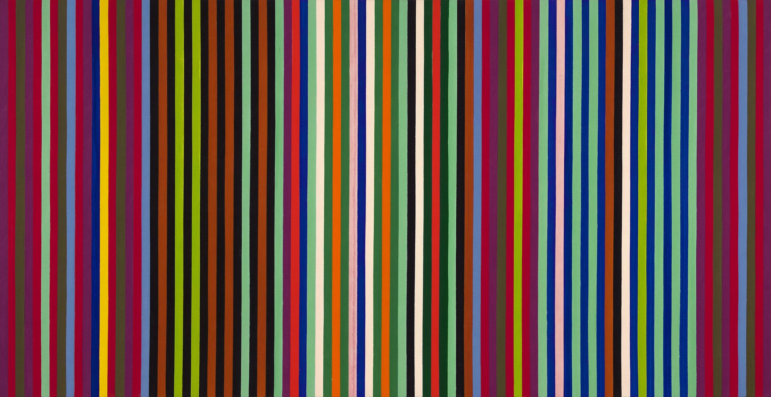
Three events resulted in Gene Davis beginning his signature stripe paintings: Barnett Newman’s 1951 exhibition of stripe paintings at the Betty Parson Gallery in New York; his introduction to Magna paint in 1954; and Jasper Johns’ target painting on the cover of ArtNews in 1958. Once Davis settled on the vertical stripe in 1959, he used the format for the rest of his life. Davis chose to work in rhythmic vertical lines as he saw his work paralleling literature or music and horizontal bands were too strongly tied to landscapes. The earliest stripe paintings were freehand then Davis methodically laid out the width of his stripes in pencil before applying color intuitively back and forth across the canvas. Davis wanted each painting to act as a world into which one could enter and stroll around visually. By 1962 Davis had systemized his approach to each painting by using vertical stripes of uniform width. The penciled stripes were masked out with tape and the first color was applied to some stripes across the painting. Then Davis moved on to a second color, purposely leaving some stripes raw as future “escape valves” to adjust the balance of the painting. Davis felt the dramatic impact of his paintings came from finding the right color to hold the painting together. The escape valves lead to the creative leap that produced the painting’s tension and thereby its success. Davis worked in this way until 1969. In Firebox, 1964, black is used for every third stripe on the left and every other stripe on the right side of the canvas. Bright blue, pink, turquoise, and yellow act as accent colors breaking the pattern of dark colors. The different patterns of stripes on the left and right sides of Firebox were a way to test the balance and unity of a painting through asymmetry. Davis encouraged the viewer to experience the painting one color at a time, moving back and forth across the canvas to see how a single color reacts to its neighbors. This replicated Davis’s own working method and allowed the viewer to relive the painting process. In the 1970s works, Davis began to complicate his compositions by working in a variety of stripe widths from thin lines to broader fields of color as seen in Green Stripes, 1970.
Paul Reed
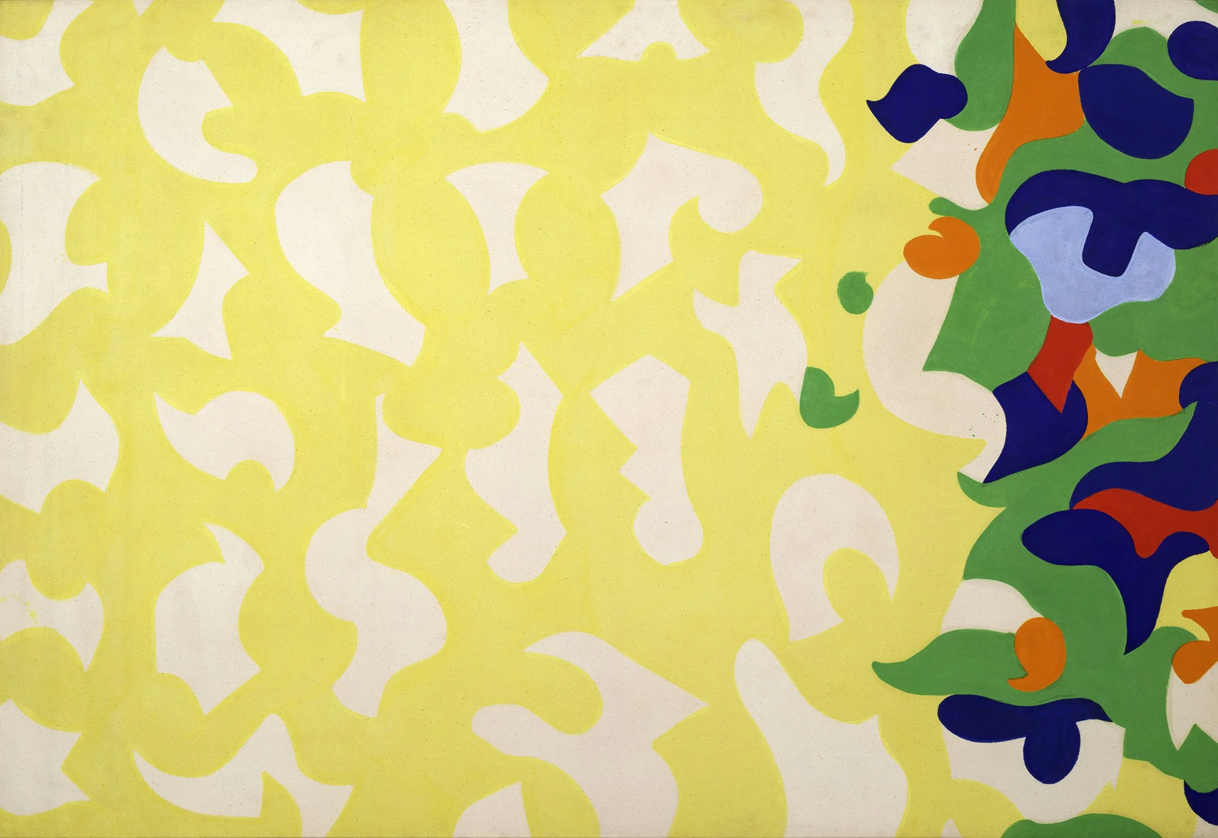
Paul Reed was introduced to Magna in 1954 by Gene Davis, but held off working in acrylics until a water-based paint was introduced in 1958. Magna was thinned with solvents like turpentine which made it a toxic medium. After years of broadly experimenting, Reed began to work systematically in series in 1962, exploring the function of color in its ability to define form and create structure. In each series, he used the transparent nature of acrylic painting. Reed had the broadest range of series within the Washington Color School. The composition of each evolving series came out of small adjustments made in preparatory thumbnail studies and collages. From 1962 to 1965, Reed focused on the centralized image as seen in the painting #25C, 1964 in our exhibition. It has an 8-petal arrangement of biomorphic shapes at its center on a field of yellow anchored by two corners of complementary colors, orange and blue. #25C shows Reed’s movement out of his 1963-64 “petal paintings” (biomorphic shapes in a circular arrangement) into his Disk paintings of 1965. #25C was reproduced in Donald Judd’s Arts Magazine review of Paul Reed’s 1965 exhibition at East Hampton Gallery in New York. The centralized image paintings became more geometric as seen in Kumquad, 1964, which radiates out in rings around a central green dot. Reed received his first solo exhibition in DC at the Adams-Morgan Gallery in 1963 and Howard Mehring wrote the catalogue text noting the feeling of color vibration and joy in Reed’s work. After 1965 Reed explored the stripe in lattice structures to examine how a vertical or horizontal stripe influenced a viewer to focus on color, canvas, or shape. This investigation led to Reed’s shaped canvases from 1967 to 1970 which were featured in Paul Reed and the Shaped Canvas at our gallery in 2013.
Thomas Downing
Thomas Downing settled in DC after studying at Pratt in New York and traveling through Europe on a grant from the Virginia Museum of Fine Art. Downing used his GI Bill to attend a summer course at Catholic University taught by Kenneth Noland in 1954 and met Howard Mehring the following year at the Sculptors Studio. Downing was impacted by Noland’s target paintings shown at Jefferson Place Gallery in 1958 and settled on the dot as his motif the following year. From 1959 to 1965, Downing organized dots into separate series of grids, dials, and rings. The grid series show how closely arranged dots produce the appearance of floating color, the dial series radiate color outward, and the ring series use a larger range of colors to push the dots off the canvas. Our exhibition offers Red Arc, 1964, a limited arrangement of two dots, one red and the other blue, on a rust red square canvas. A halo within the field of rust red holds the bright red and blue dots in orbit. The Dot series was shown in Downing’s 1968 La Jolla Museum exhibition. Related dot paintings are Blue Spell in the Phillips Collection and Green Melt at the Harvard Art Museums. Downing’s experiments in color and composition in square format dot paintings led him to produce related shaped canvases starting in 1965. In one series of shaped canvases made in 1965 - 1966, Downing placed grids of circles within a parallelogram shape, such as Untitled (Variations in Red). These shaped canvas were developed in gradations of one hue- often red, blue, or green - with each dot’s color chosen to work with the shades of its neighboring colors. Downing achieved his greatest perspective illusion in the 1968 Fold shaped canvas series of three paintings. In our exhibition we offer Fold Three in which Downing used unusual color arrangements that seem to fold and project, causing the view to question whether the painting has actual depth. The Fold works were exhibited at the A.M. Sachs Gallery in New York in October-November of 1968 and in the Aldrich Contemporary Art Museum exhibition Highlights of the 1968-69 Art Season in June-September 1969.
Howard Mehring
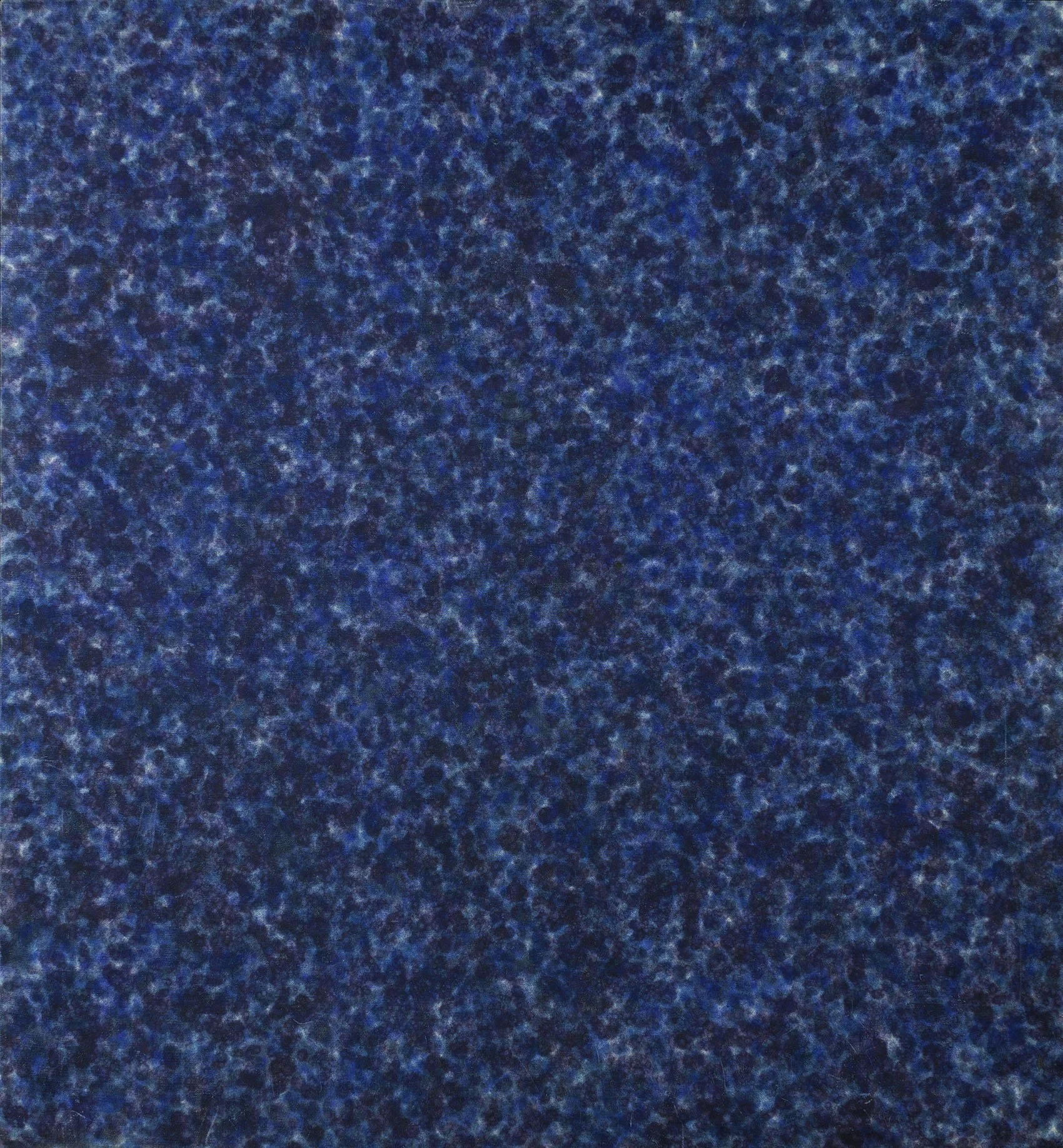
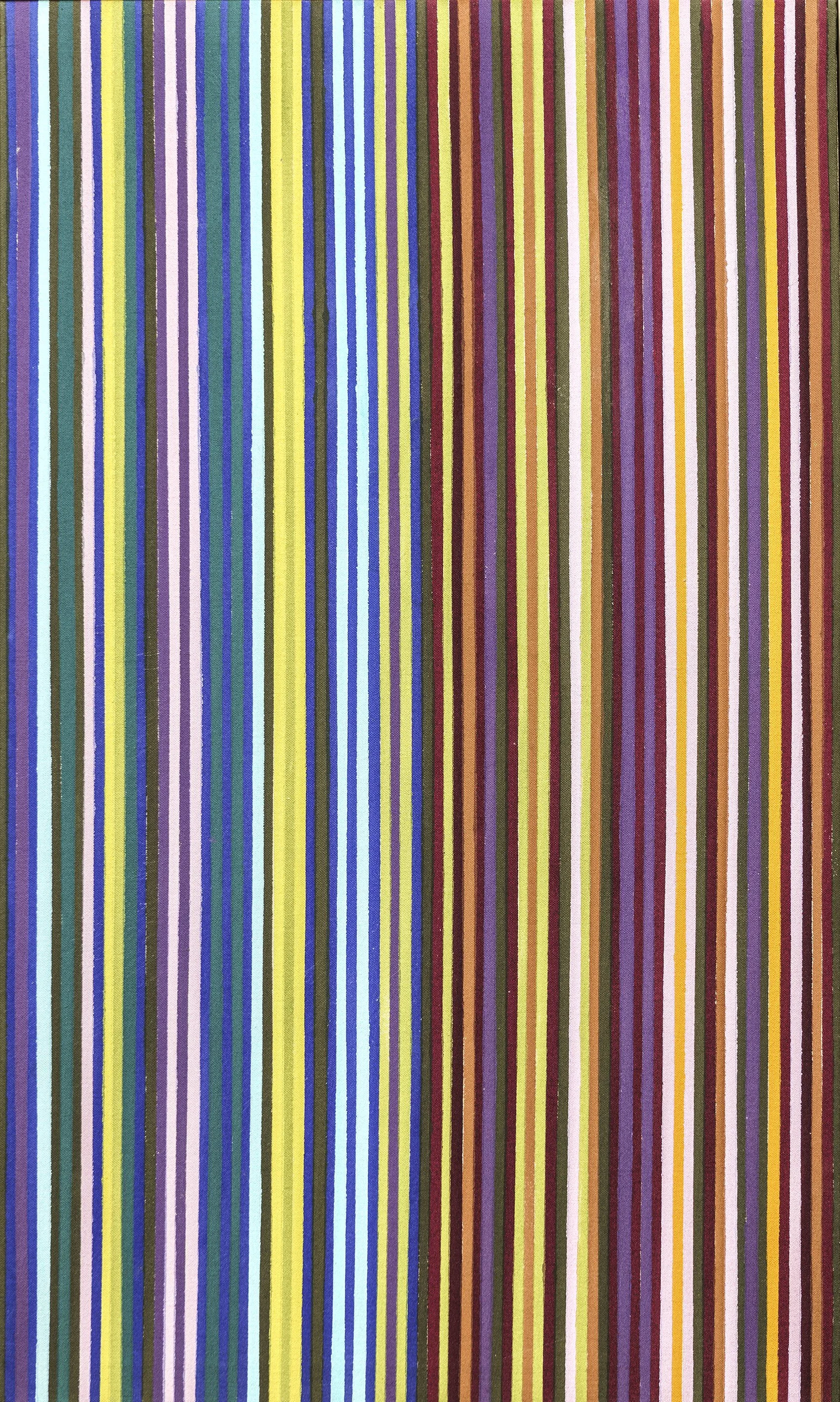
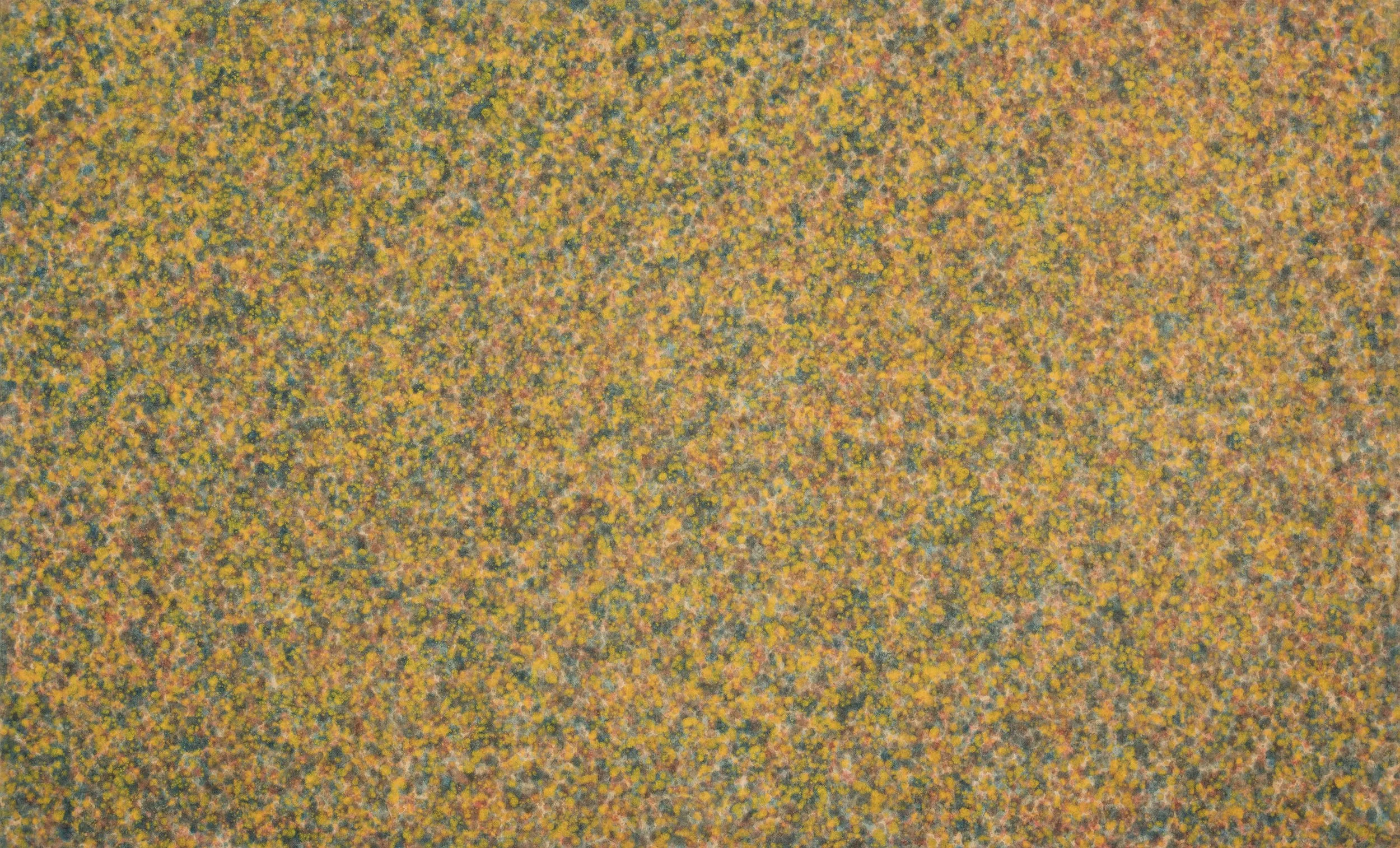
Howard Mehring enrolled at Catholic University in 1953 in its MFA program. Kenneth Noland was an important instructor there and became a good friend with whom he shared a love of progressive jazz. After graduation, Mehring met Thomas Downing at the Sculptors Studio and the two shared a studio through 1956. Mehring first poured enamel and metallic paints, moving to Magna stained into the canvas in 1957. Mehring had his first solo exhibition in 1959 at the cooperative Origo Gallery he co-founded, which included his first all-over paintings of poured and loose marks. The Origo Gallery was short lived and Mehring and Downing joined Jefferson Place Gallery by 1960. From 1960 to 1961, Mehring painted an all-over series of small spots of color, which he felt maintained attention across the entire canvas. He dripped or stippled dots in layers of color to create a surface that opened up and breathed, looking for a way to have the color expand and contract in front of the viewer. In our exhibition we have three of the 1960-1961 all-over paintings. In Untitled (Forsythia Spring), Mehring drips bright yellow over thinned blue and red, creating an experience that parallels how we see color in nature with the dominant yellow interrupted here and there with other colors. A more geometric style focused on the edge of the paintings began in 1962. In these Mehring collaged pieces of his all-over canvases into geometric arrangements. Mehring liked the break between colors that the collaged canvas edge provided as well as the energy the arrangement brought into the center of his symmetrical compositions. These works were exhibited at the Jefferson Place Gallery. By 1965 Mehring was working with a saturated brush in his stripe series of T and Z paintings, which continued until Mehring stopped painting in 1968. His mature work in total spans just eleven years.